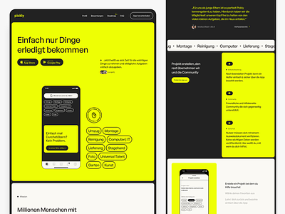
PickAnAnt Rebranding Concept | Landing Page
Hey Dribbblers! 👋
It's about an app called PickAnAnt. On this project i wanted to look what if i would do a complete Rebranding on this mobile app and the Website. How would it look like? Here is a concept for the Landing Page. You can also see a new Logo and Name for this (just to make everything new). About the app there is a really cool idea behind it, you can add a project something like "Put my ikea kitchen together" and other people can send you an offer on that to help you.
You can find PickAnAnt here: https://pickanant.de/
And the cool hand icon is from the Phosphor Icon Set: https://phosphoricons.com/
Would be happy to hear some feedback from you! 😊
Don’t forget to drop a ❤️ if you like it!
More by Eduard Bodak View profile
Like
