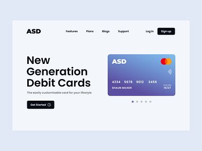
Card company landing page
I've always wanted a clean banking website for personal use. Most of the banking websites in India looks cramped and uneasy to use. So I've tried to create a cleaner and minimal looking landing page of a card company. A daily experience of using clustered banking website ignited me to do this particular design. Hope y'all like it.
More by Shane David View profile
Like
