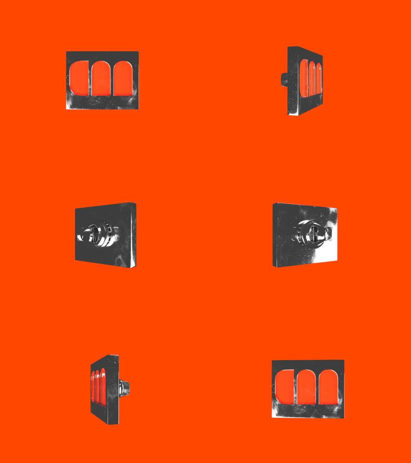
Logo for bar association
Client
Strategicheskij Pravovoj Partnyor is a bar firm that defends the interests of its clients in practically all fields of law. In a year and a half of work the company has managed to gain a foothold in the market, but in order to raise its awareness among the target audience the bar association needed a logo.
Task
To design a minimalistic logo that will increase the company’s recognition in the market and become the basis of the future brand identity.
Solution
We based the logo sign on the Imagery of antique columns and sunlight shining through them. The icon of the columns also has a meaning. They are a symbol of stability and support: when a client faces complex legal matters the lawyer becomes the main support for him and takes care of the problem.
The logo is created in orange, which in turn is close to the sunlight. The sun is a metaphor for hope: the hope of success in a legal case. We chose the optimum shade of orange: one that will not only look great on the site, but will not get distorted being printed on letterheads.
The logo font is called "Podkova". It supports the overall conceptof the logo. The thickness of the letters and serifs make it solid and substantial, but not too officious.
Want to boost your business with memorable design?
Get it with 10% OFF via promo code «Dribbble»⬇
