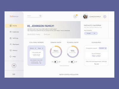
#12 Gumenna Natalia | UX/UI Designer | Interface for Day Zero
Test task completed — May 5, 2022
Contact — @GumennaNatalia (telegram)
Portfolio — https://www.behance.net/nataligumenna . https://dribbble.com/Gumenna
Our comment:
We liked the non-intrusive colors and the linear separation of content. But there is a lot to improve — for example, accents . There are a lot of colored blocks on the page that do not match each other in terms of brightness. The work on typography is poor. For example, all font levels in this block are the same, and there is no visual hierarchy. The page's unaligned spacing makes many blocks fall apart.
More by Lazarev. talents View profile
Like


