Haekka App Icon
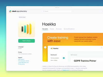
Haekka is a Slack-based Security Awareness and HIPAA platform for training.
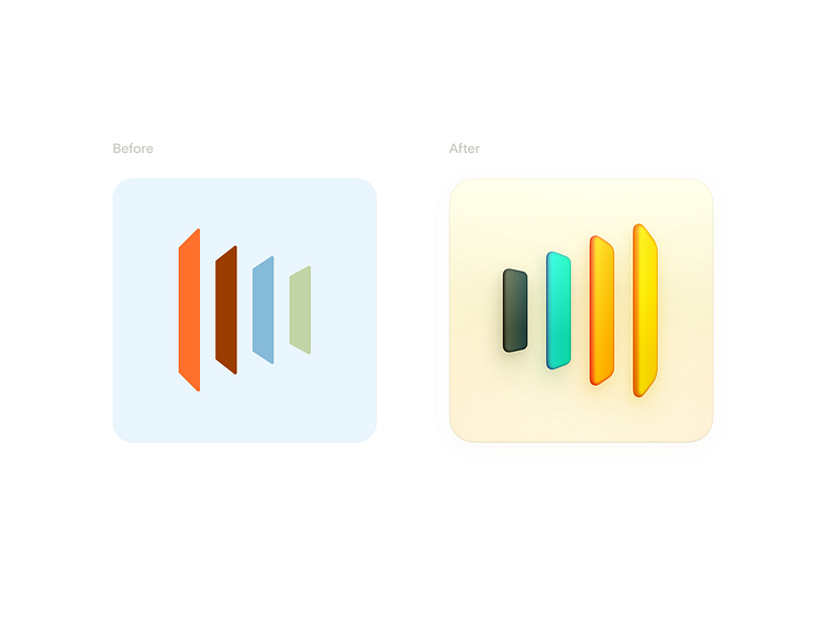
I had the pleasure of working with the team at Haekka to refresh their brand and presence in the Slack App Directory. We focused on the company icon, logo and lockups, brand marketing material, color palette, and type improvements.
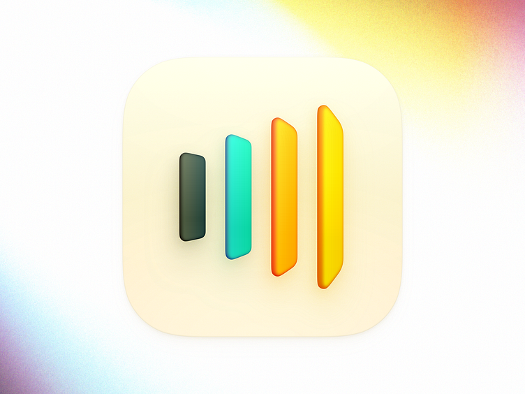
The icon was intended to be a centerpiece for the brand refresh. It had to be legible and evoke perspective as a glyph, but also have enough heft to accommodate shading and drawn-in perspective.
The side shading has slightly varied thickness due to the perspective, as well as reflective lighting between the slabs. I did a lot of experimentation to arrive at the particular color scheme, as it would not do to just use another rainbow, as we see often in logos as a cop out from being decisive about what the sensibility of the brand intends to be.
Lastly, I particularly wanted to contrast the noise in the shadow and background with the smooth surfaces on the slabs.
Be sure to see the before and after below: