Child Care / Kindergarten Logo Design
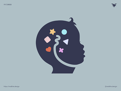
Logo design concept B for Absorbent Minds Montessori.
Absorbent Minds Montessori is an early education and day care centre soon to open in the Moreton Bay region, becoming the first childcare centre of its kind in the area. The Montessori approach encourages children to learn at their own natural pace, creating an environment that promotes self-confidence, independence and a lifelong thirst for knowledge.
The centre will be custom built to create this learning environment, using natural materials wherever possible, and employing educators specially trained in the Montessori approach. The target demographic is sophisticated and ambitious parents with an understanding of the Montessori method.
Our brand identity had to be professional and sophisticated, appealing to the parents in our target demographic, whilst remaining friendly and appropriate for the sector. We will avoid childish clichés that are commonly used in day care brand identities.
We really liked the silhouette from concept A as it was friendly, thought provoking and fairly neutral in terms of ethnicity, which was important for the client. We therefore repurposed this but added an abstract windy shape representing the brain stem absorbing knowledge. Again knowledge is communicated in the form of shapes and colours (some of the things kids learn in their early years at child care).


