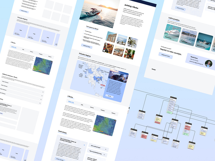
Redesigning destination page
Challenge
The team in yachting.com was working on a redesign of the destinations page to show the possible choices and inform the user a bit about the direction and choice.
I was tasked with mapping out possible options for redesign, basically creating new ideas based on data and competition research.
Data has shown that bounce rate on these pages was extremely high + the overall conversion rate on the whole website was lower than expected, but on the other hand users visiting destination page about Greece mainly wants to know more about destination. Not really renting/renting a boat...So quite a challenge.
Approach
From the users standpoint, previous page had a lot of content people necessarily did not want to see, they had to scroll and read a lot before getting to the part they actually wanted. (one of the reason for higher bounce rate)
Users can also struggle with wrong amount of whitespace between elements and a bit confusing layout centered on company goals rather than user's.
As a result of this, i decided to start with completely new layout, first identifying problem areas, second sketching new layout, third creating a sitemap.
Product Design
As my role was bringing ideas to the table, i decided to experiment with more options, validate, consult with our team and evolve from there. My main goal was to design more simple and clear layout, possibly combine it with management need of getting users to convert.
I explored several different concepts on various components on the page, displayed below.
Region Guide Component - Carousel/Map/List
Introduced 3 options:
1) Carousel - where user can scroll right/left through different regions. Advantage comes in with easing the whitespace on the page, all the information user sees is on dedicated page when clicking. For experienced yachters it is very handy, for less experienced not as much. Technically easy to implement.
2) Map
Nice ui interaction, user clicks on wished region, overlay slides from right with basic information and click through button on dedicated page.
3) List
Clicking on list item, information pops in. Great for instant information, does not need dedicated page on each region.(good or not?). On the other hand it takes a lot of whitespace.
Boats for rent - Image Carousel/ Instant
2 options for this component.
1) Image carousel pushes users to go into website's renting/converting page- showing only boat categories to rent.
2) Instant renting carousel shows user limited amount of boats for rent in the area.
Competition uses the 2nd option, but just because the competition is doing something doesn’t necessarily mean it’s right for your business....So we have chosen the 1st.
Results
Added conversion rate
After multiple discussions and version my final page design was implemented, started pretty slow but overtime our choices slowed down the average bounce rate on destination pages, while it helped increase overall conversion rate on the whole website.
User's increased focus on destination pages
My first idea was that users coming onto destination page are mainly interested about that destination, what do to, where to go there etc., not really looking to rent a boat. Other members of our team disagreed, and I was happy my intention came true.


