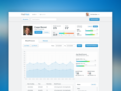
Dashboart - health
Hi guys, another dashboard i'm currently involved in, this represents what a doctor will see about it's patient, it's still a work in progress, i figured i could post it here for some comments before showing this to the client.
I chosen the blue color as it feel appropriate with health.
Since i never worked on a health dashboard, for the layout i found my inspiration in Andrew Lucas work, which by the way is a fantastic designer, also the style has his footprint to.
Just let me know what you guys think, bad or good i can take it.
More by Anghel Gabriel View profile
Like

