E-learning mobile app
Hi, Dribbble!
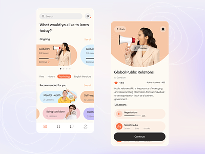
Please take a look at our new concept! It is an application for various online courses. The home page shows the progress of the classes that the user is currently taking. The second screen has a course page with basic information about it. Here users can see the number of lessons, the progress of each task, and the schedule for each class.
The whole design is made bright and, at the same time, pleasing to the eye colors. Pastel tones will not prevent users from spending a lot of time in the application because their eyes will not get tired. And brighter colors serve to draw the user's attention to a course. We also made figures of people protruding beyond the cards to attract the user's attention.
How do you think we’ve coped with the task greatly?
Like it? Don't forget to follow Axicube! ➡️
You can also find us here: Instagram | Behance | Linkedin | Facebook
