P Identity - A/B Comparison
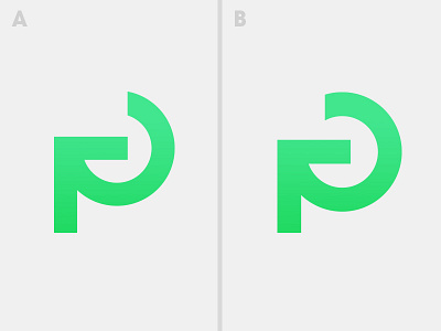
Alright guys, I need some help... Been tweaking and staring for too long. My goal was to create a simplified "p" while subtly alluding to the concept of giving back (via a clockwise motion and arrow pointing backwards).
I lean towards A for it's simplicity and symmetry. The hangover/terminal of option B just looks a little awkward compared with A and it also makes the mark look like a backwards "G"—which isn't ideal.
After additional comment, here's option C (obviously need to clean it up though): http://cl.ly/image/2D3E1P3y3b1d