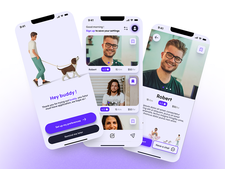
Buddy - Dog Walking App
Bonjour ! 🥐
This is part of the Dribbble product design course learning end to end product design process.
Time : 5 weeks
My role : Research, User flow, Wireframing, UI/UX, Prototyping, user testing.
Type : Course project
The challenge
Assess the dog walking business. Create a service to connect dog owners with walkers. How we can help dog owners trust their dogs are in safe hands.
My goal
Create an app that inspires trust by looking and feeling professional. Also providing the tools to the walkers to build trust by showing their experience & personality.
Core Needs
Quickly finding a trustworthy walker.
An activity tab for updates with an open communication line at all times.
Easy and simple interface to manage current and future walks.
Pain Points
Can’t trust random walkers about taking care of their pets.
Their limited availability to take care of their 1 or more dogs.
The sadness of leaving their dog alone at home.
Worried about the management of their dog in difficult situations
Our users are busy pet owners, mid-high income & the elderly. We’re trying to easily provide a trustworthy & skilled dog walkers in short notice.
I sourced & selected people who were long time dog/pet owners because this is where the emotion is the strongest about their pets.
I found out that the business is badly perceived. People would rather call family or people they know to take care of their pets.
When pushed towards using those types of applications; trust is the biggest concern.
Research based on Lyon, France. 🚩
I found 3 major companies, they all have an identical layout. This indicated me that this sector is crowded and standing out is difficult.
Also, many google results are individual freelancers with their own websites.
Because of the time constraints, this is only the part from onboarding to booking a walk.
First user flow. My goal was to make it as simple as possible while still meeting the business goals and user goals.
I refined my user flow over the length of this project. This helped me to realize some functionality were missing or would be a great addition.
The first iteration following the user flow and laying out some ideas.
I kept reworking the wireframes over the project when I thought about a feature and wasn’t sure how it should look. This is why it’s looking almost identical to the end product.
I’ve focused on making the onboarding process more enjoyable, made it bigger to have more clarity. It’s where all the competitors are lacking.
I Made the card bigger to display more data with a larger image. Putting forward the human side of this business.
I needed a color that meant "trust" and avoid looking like competitors (blue / green / pink).
This why it’s a mix between Blue (Trust) & Purple (Compassion) important in animal care.
Here’s the luminescence map (without the 10%), useful in making the colors stand out of each other.
For accessibility purposes the contrast between the colors are all certified AA minimum.
The typography here is adapted for mobile, all are a multiple of 8 on a 8px grid. I played on the weight and colors to make contrast and have minimal font variation.
I gave the buttons with an illustration an angle to make it more dynamic.
Everything is made in auto-layout with each component built-in animation.
During the user test, a major flaw came up. At the last onboarding page “Dates”.
I added a step in the onboarding at the very beginning that you can’t skip and make it straightforward about what you want out of this app.
I also made the indicator of the progress more distinctive, some confused it for a slider when arriving in the middle of it.
The preselection of the most common user settings was a welcomed feature.
For bookmarking a profile, I first tried a sliding of the card feature like in Gmail.
I tested the user, they clicked on the profile and then pressed the bookmark button. When pushed towards trying to swipe the card they did not like the feature at all.
To fix this I simply put it forward on the all cards, avoiding extra steps.
Making the app with the smallest learning curve as possible.
Here’s a link to try it out : Figma prototype
Because of the time limitations, I didn’t make every animation as to what I envisioned it.
Results
Did I succeed in my goal ? Let me know ! 😉
Thanks to @Billy Sweetman, my mentor during this project; and the whole group for their feedbacks.


