Slack - Logo Redesign 💬
Slack transforms the way you work with one place for everyone and everything you need to get stuff done.
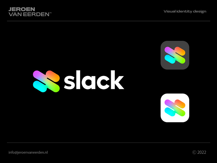
Sometimes when working on a project, some ideas pop up which trigger me into exploring more. This concept actually is made years ago and never found a home, unfortunately. As I played with colors (mainly the free gradient tool), I loved how vivid and still suitable the logo remained. The idea of colors overlapping and mixing together like fluid, really compliments the core idea of what Slack is all about IMO. Still, the speech bubbles are in the letter S in an abstract and subtle form.
What do you think of this redesign?
Little side-note; I like the current slack logo and do not think they even need anything different. The abstract and timeless mark is already a good fit. So basically this redesign is just for fun as creative exploration.
Hope you have a great Wednesday everyone!
-Jeroen
Are you interested in working with me?
Feel free to reach out via the Dribbble inbox or direct e-mail:
👉 info@jeroenvaneerden.nl
