Petigree: Pet Services App
Got a degree in pet care?
Petigree was an app created as an assignment for Dribbble's Product Design course. It was created as a space for pet-lovers to connect and offer their caregiving expertise and request services for their pet-astic children.
This case study breaks down the process of how the need for dog walkers inspires the creation of an app most beneficial to our beloved animal friends.
So what's the problem?
As much as we'd love to tend to our pet's every needs all the time, some days it's just impossible to juggle all that life throws at us. Petigree was first inspired by the challenge that dog owners had for finding time to walk their dogs.
In the early stages of the problem statement phase, the scope was to consider the needs for the dog walking business. After conducting surveys and participating in mentorship discussions for this Dribbble course, I realized this business could grow to accommodate pets in general, and not be limited to walking services, but also pet sitting, training and daycare services.
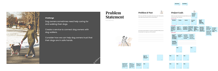
For the business goals, we wanted to provide reassurance, credibility and helpful services to tend to our customer's needs & doubts.
For the owner goals, convenience and reliable sources was to be prioritized.
As for the walker goals, they need a way to sell themselves in the market but not at the cost of accepting clients beyond what they're comfortable with taking on.
A full-fledged app in 7 weeks?
That my friend, I wish! With 7 weeks as the timeline for this project, I had to be intentional with what was achievable for the project scope. This case study will focus on the perspective of a pet owner, one that's new to Petigree, who explores the pet walking service up until its checkout point.
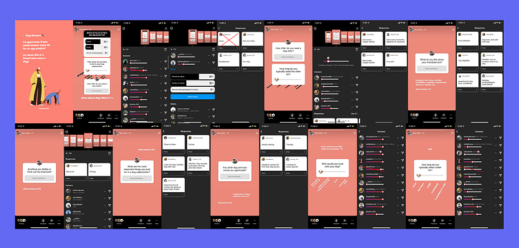
Instagram surveys? Yes, please.
Users tend to enjoy participating in surveys when you hide the mundanity of it. Rather than the conventional interview or Google Forms, I tried to make it a fun and interactive forum on the social platforms where most of my friends lurk about– Instagram.
The key points from what I gathered :
People want reasonable pricing
The convenience of location & availability is much needed
Rather than experience, people cared more about if the service provider will genuinely love and care for their pet
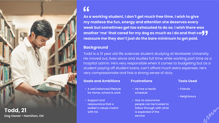
The muses behind the product
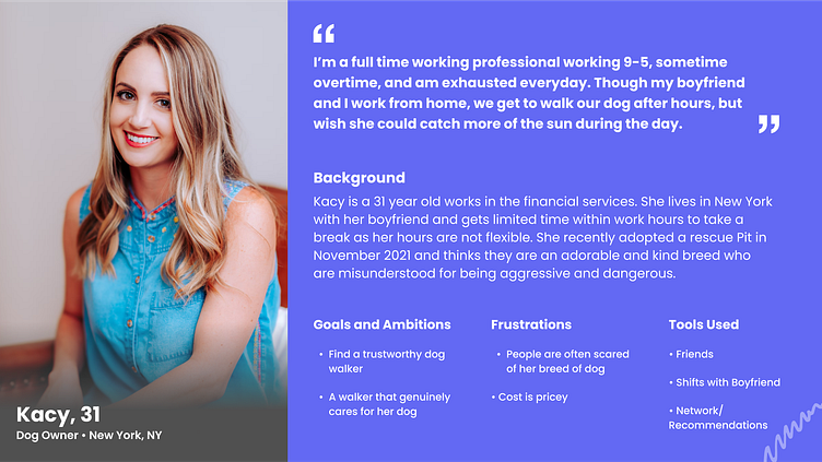
Meet Kacy & Todd. These two personas are composed as a summary of the data collected from my Instagram survey & polls. They're based on the real-life answers and stories from the 10 pet owners that participated in my questionnaire. This allows for clear margins on what pet owners would need to achieve in a pet services app.
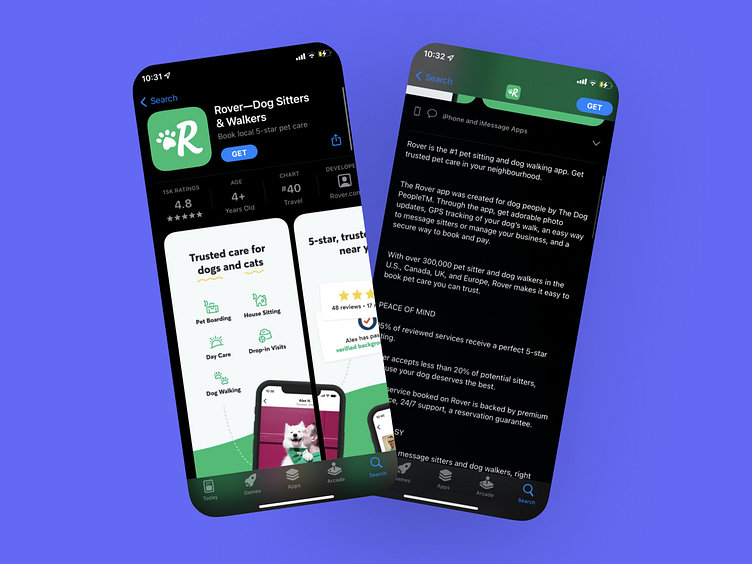
What are our competitors up to?
Now that we understand our problem statement, it's time to deep dive into building our solution. First, we need to understand similar products that are out there. In this case, we snooped around Rover & Wag's onboarding flows.
For the scope's sake, let's focus on the onboarding flow. The biggest difference between the two's onboarding flows was that Rover was more straightforward and concise and Wag had very lengthy process just to get started in the app. However, both required their user to create an account before checking out their app's services.
User Flow: Onboarding
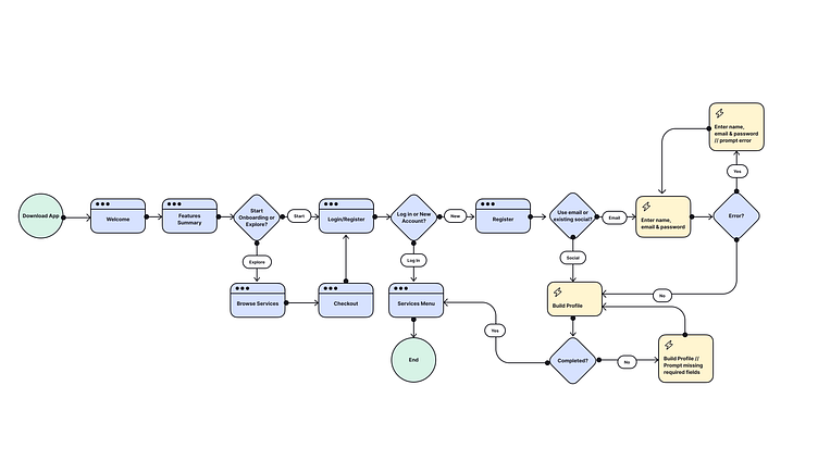
In my onboarding there were two main functions I implemented that were different from Rover and Wag's process.
1. The explore option
2. The features summary introduction
Inspired by Uber Eats, I decided to add an explore option on the register and sign up screen so that people can have the option to check out the product & services before committing. There's also the features intro that users will see when they first download the app to let them know what to expect from the app.
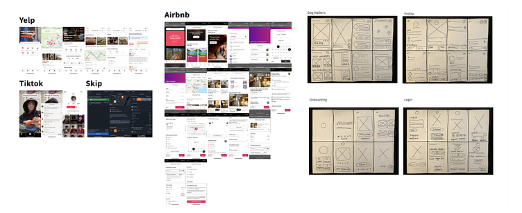
Crazy 8s
My main screen layout inspirations were Yelp, Airbnb, TikTok & Skip the Dishes. Here, we have the initial sketch ideations for the onboarding, login, walker search & walker profile interfaces.
Wireframes
Concise and straightforward flows are obtained by cutting straight to the points of the key elements users seek. The goal, find a favourable pet carer and book their service.
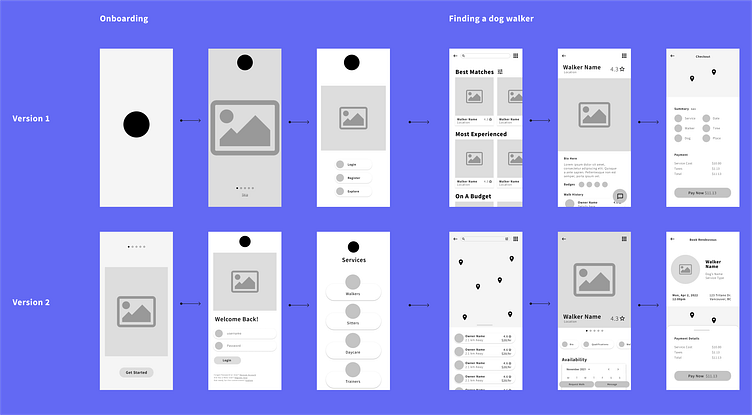
Version 2 prioritized having a straight forward checkout by providing users the option to open tabs and browse for more information if needed. I decided the walker search screen should combine the cards/categories/details in the 1st version with the map found in the 2nd version. For the walker bio, I moved forward with having the 'request walk button' at the end of the walker’s profile page as a cta after filling out the needed info that’ll lead up to it.
Another value for the layout was to achieve a humane look. One that prioritizes community & values its users, over just being another service product. The checkout reflects this by setting it up as an appointment between two people rather than just a cold transaction to purchase a product.
Moodboard
I made sure to keep it light, energetic and friendly as people should feel when they network with pets & service people. This coral/salmon hue became the primary brand color and the purple was used as an accent color.
Visual Design
Inspired by people-centric illustrations & community, you'll notice minimalism was the key concept to ensure users have a clear path to take.
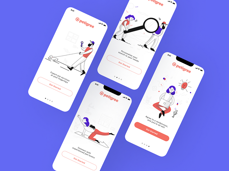
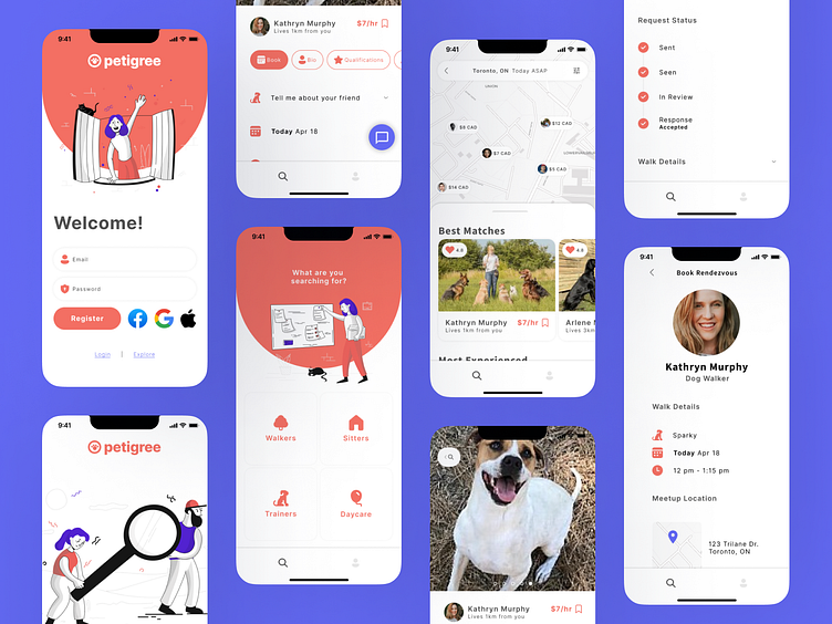
Features summary introduction.
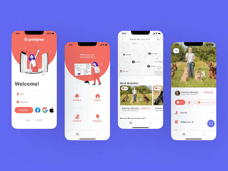
Explore the pet walkers service.
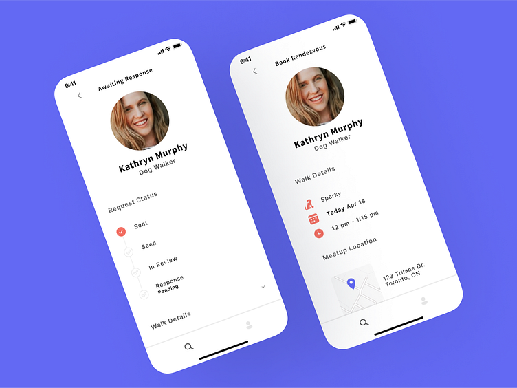
The checkout experience.
Components
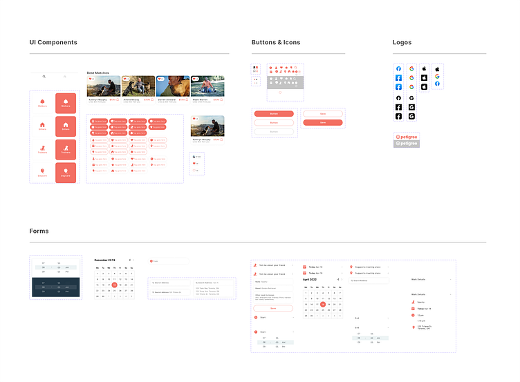
As the typography, color and overall visual system gets built, so does the components library. Here are the ones used and standardized in Petigree.
Prototyping
Once the final screens were established, other details were built to build upon the functionality of the app. The focus of this prototype was to show the experience of a user exploring the pet walking service from download to checkout.
That's a wrap!
And with that, a new app was born. Though this assignment was cut short, there's lots of possibilities and opportunities for Petigree to grow and develop into a network hub for pet-lovers everywhere.
There are many more steps to be considered if this app were to be fully fleshed out! Here are some I would as the next action items for this app's development:
Make service provider bio tabs functional
User profiles & how it affects their checkout/networking experience
Flesh out the other services' screens
Construct the UI from the service provider's perspective
And many, many more!