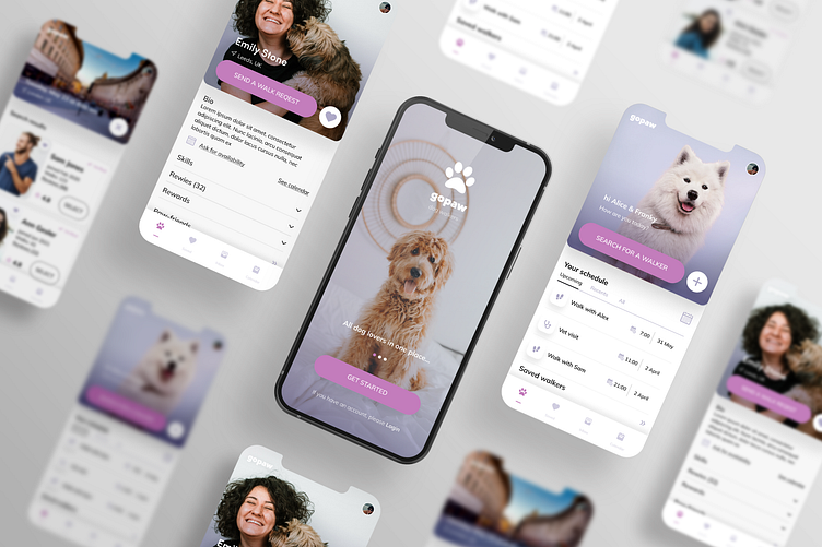
GoPaw: Dog Walking App Case Study
The Dog walking app concept is a result of my Product Design Course that I took with Dribbble. Following the Product Design Process step by step and learing about the users need and expectations.
My Role
For this concept project my role included all steps. Starting from user and market research and defining the problem, through user flow, UX design to the final view of completed responsive UI design with components library and product testing.
Defining a Problem & Finding a Solution
After the interviews with the dog owners I realized that their biggest issue is a fully trust in a potential dog walker. That's why I decided to add the profile verification and strong rating & reviews, as well as access to the app and profile view just after logging in - to avoid random viewers. The app features were limited to dog walking only because of strong feedback with lack of trust to bring the dog to strangers house or even worst to let the strangers in their house.
The research showed that main goals of the users are to have a professionals and animal lovers who will be a long friends of their pets. For this purpose was created the "saved walker profile / saved dog profile option hid under the heart icon on profile pictures. This easy access allows users to come back to their favourite profiles.
Design & Usability
The GoPaw app concept is based on two key options: Calendar & Localization.
The algorytm shows in searching result the walkers available in chosen time ( the walkers are choosing their time frame for every week or month in which they are available to work) and based close to the doggy and his owner location. This way we can easily cut the persons on the other part of the city and be sure that our pet will meet his 4-paws neighbours in their favourite dog park and that the walker on the other hand don't have to loose time on the logistic of moving around a busy city. Another unconventional option is a system of Request & Accept. I am leaving the choice of accepting or refusing the walking request to the walker. In case of physical or mental holds connected with the dog breed, size or charakter described on the dog profile.
Testing & Learning
During the prototype testing I learnt that some options are not so intuitive as I assumed. That pushed me to redesign the home screen and move the "add new event / picture" circle button next to the main "search for a walker" button.
Another lessons was a colour contrast and readability that I improved after the reviewing and testing with others. Beside of that users who tested the prototype gave a feedback that process of finding and booking the dog walker is easy and intuitive for them.
Designer note
I decided to keep app UI based on real pictures as credibility is the key value to the potential dog owners. Home screen has an easy access to searching flow and the full view of all scheduled walkers and other events connected with their lovely pet like: vet visits, vaccinations reminders, play dates with other doggies etc. I wanted the GoPaw product to be our dog calendar and notebook place. On the homepage are included also a popular dog tracks where the owner or walker can choose a trail perfect for his four-paws.


