RadPad v3.1
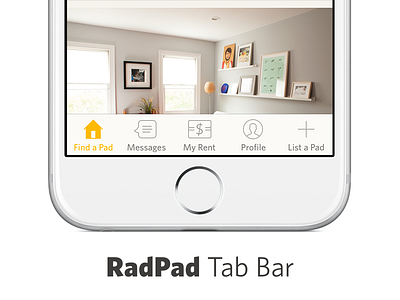
We made the switch from a hamburger/shitty nav to a tab bar for RadPad, because it's vastly superior usability-wise. We scoped out future product features and found we could comfortably fit everything into 5 separate areas of the app. Paring the information down and clarifying things have driven engagement up. Write-up coming later this week when I have some more hard data.
More by Tyler Galpin View profile
Like


