Scarce Resources Dashboard
This is solution of Crowwwn's weekly design challenge.
Problem statement - When global issues arise, I want to see which resources are becoming scarce, so I can prepare by planning ahead.
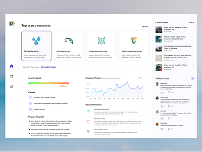
My Solution - Hello there, This week the design challenge is quite new and interesting. I tried something new this week. I planned to design a desktop website instead of a mobile app. First, I gather all the ideas to create a desktop page that contains all the information regarding resource scarcity. Then I noted down all the information which should be mentioned while showing the global scarcity issues. After a couple of iterations, I come up with this design solution. The navigation bar would be on the left-hand side which will help users to navigate to the website. At the top, I showed the top scarcest resources and by default, the first one will be selected. Below that, I am showing all the required information related to the selected resource. First, it will show the level of scarcity. Next, I mentioned all the causes which are responsible for the scarcity. Then I educate the user about how to face this scarcity and how to prepare for that. The graph will show the historical trend related to the resource. The alternate resources will be helpful to the users to manage their lifestyles. On the right-hand side, the User can show all the latest news to stay up to date. The public forum will help user to convey their thoughts in public. So, that is all about this week's challenge. Let me know your thought regarding my design solution. Your feedback will be greatly appreciated. Thank you.