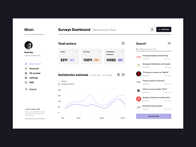
Survey Providers Dashboard - Website concept
Hey friends!
One of the important goals of a company for tracking the success of individual aspects of the business or the company as a whole is reporting. An effective tool for processing and analyze indicators is a dashboard. It is a collection of figures and graphs that provide a concise and clear opportunity to identify trends, determine the relationship between different indicators and prevent potential problems.
Thanks to a clear and understandable structure, convenient search and work within a single screen, a company can easily compare analytical indicators and make strategically important decisions based on them.
In this work, the main task was to create a clear and easy-to-use interface, with the ability to switch between names and compare the progress of user engagement and the total amount of completion of surveys and feedback. Thanks to gray tones and linear construction, the business style is maintained, while retro purple accents add a touch of brightness to the compositions.
Did I succeed? Share your comment below.
📩 Interested in UX/UI Design for mobile or web applications? Check out more on steelkiwi.com and contact us hello@steelkiwi.com
