fenerbahçe (sc khalkedon) x puma concept set
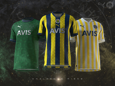
a couple years ago, i came across the checkered navy blue - yellow flags at fenerbahçe stands in 70s. i barely remember the flags in early 2000s but i thought that they were extinct. it didn't take long for me to realize that I was wrong, flags are waving in the stands even today. this is the main idea behind the home shirt.
i've always considered the checkers as a naughty, cheerful and unpredictable pattern. therefore, i placed darker checkers on navy blue stripes and jacquard checkers on yellow stripes. this ensures the waving flag look as well as uniqueness. central positioned logos and modern v-collar enhanced the uniquenes for sure. little trims on the sides of the skirt connects the shirt with 115 years old white shorts and socks.
on the away shirt, i was about the design a croatia-esque checkered shirt with white and yellow checkers. then i followed a different path. this set may be considered as the 115th anniversary set, so i gave fenerbahçe their very first home shirt as an away, with a simplicity they never had. thinner white and yellow stripes like the "literal" shirt dated to 1907. unlike the previous "foundation" shirts, i went after light navy that may be considered as darkish blue. white modern v-collar and large trims -like the cuffs of a shirt- completed the basic look i searched for.
i always see the third shirts as a clean canvas that must filled with contributive elements to football shirt history of the club. green is one of the colours of fenerbahçe crest and worn back in 2011 and 2018. unfortunately, those were failed attempts. since i wanted the contribute the green shirt legacy, i followed a different path from previous shirts. i designed the pattern -which contains lighthouses (tr. fener) and shield of the crest with light rays- one and an half year ago, when the deal between puma and fenerbahçe officialized and inspired from the rinascimento shirt (maglia verde) of the azzurri. but my graphic is some kind of art deco-ish, instead of renaissance-inspired graphic. the tint of green was chosen from the fenerbahçe cape's (which the club derived its name from) vegetation. the navy collar and trims with white and yellow stripes (which you can easily guess a reference to the very first shirt) enhanced the unique yet friendly look for sure. chrome prints and green-chrome monochrome crest complete the shirt. in my point of view, this is a great and contemporary attempt.
you can check the detailed renders on my instagram account: @ozandographics. feel free to contact me if you have anything to ask or for business inquires. thank you for checking on.
p.s.: khalkedon was the greek name of kadıköy district in roman times. (also known as chalcedon)