The Language of Flowers (bookmarks)
This is an imaginary start-up brand that I have come up with after reading a Victorian book on the Language of Flowers. Every single product was designed by me from scratch, in order to make it more personal and thus more powerful, more sincere. This is a personal project.
It is meant to be the beginning of a creative and practical brand that covers multiple aspects of nature. In the future, it will gather more and more authors, each with his own book or collaboration. Yet, all of them will have this theme: learning to see nature, its benefits, teaching each other how to survive in nature for months and possibly for years, no matter the surroundings.
As for the design process, it was my wish to make it modern, thought-provoking and eye-catching.
In this way, I could bring it back to life and remember there is a language not many know, a creative language that, if known, can be a bridge between people.
The main challenge was to make it responsive to our contemporary way of expressing ideas as the Victorian way, even if wonderful, might not be of interest to many people who look forward to using images and concepts in a minimalist, colorful, easy-to-read manner.
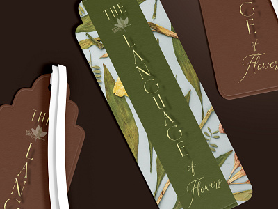
I have designed six bookmarks that can be used with other books as well or be given as gifts. This way each product makes it more and more known and creates curiosity to check it out.
The idea was to create an entire brand with multiple products. In this way it seems brought to life by recreating an entire universe of flowers and their language. Having more products makes it seem even more realistic and more ”palpable”.
This is why I wanted to design from scratch each product, the first being a book cover design.
To this, I added an agenda that can be taken on each trip and exploration journey. The reason behind it was to engage the reader, to help him learn this language through daily practice. As we all know, a language can't be learned by simply reading a book, but by starting to hear it around you, to practice it, to make it a part of your thinking. This agenda is the answer to this challenge. Being of small dimensions it can be easily carried around.
For the House and Publishing Editor, I have created a simple Logo with contrasting colors and a small icon.
The colors and the icon encapsulate in them the whole meaning of this publishing house: learning to see the beauty and practicality of nature.
The same icon will be repeated on the cover of the book, making it even more simple to connect the dots.
To this I also added a calendar that can be used as a reminder, having a section where you can note things to do. Each month has another flower as a theme and by this, the curiosity and diversity makes it a true gem to have.
On the other hand, I wanted to make something special for its first edition release so the readers and the curious will be able to see and talk with the author during his first appearance.
For this, I have created 5 billboards. For smaller places I believed posters would be a great idea, that's why I came up with 4 types of duo posters.
Both the billboard posters and smaller posters have the QR code attached to them, to make it easier to check the website and the release date and location.
The billboards have no more than 3 pieces of information, while the posters have more details added to them, as people usually wait for the subway and tramway for a couple of minutes, compared to the billboards that are usually very quickly passed by.
As this brand doesn't yet have a library where the gatherings can be held the meeting will be taken care of in collaboration with its editor House and Garden Publishing and the City Hall Library.
To get the latest updates on my projects, illustrations and services I offer don't hesitate to follow me.
I also invite you to see the complete work on Behance, Instagram and on my personal website.
