Non-Profit Home Page Edit
Quick home page edit for a non-profit I recently consulted via Catchafire (an awesome organization for connecting organizations with skilled professionals. I highly recommend volunteering via this platform).
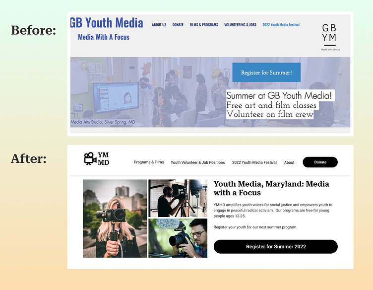
Some of the things we talked about were: having the logo to the left, making donate button more prominent to drive more donations, removing text from images, making the organization's mission more clear, and making the summer registration call-to-action more clear with full sentences.
I did this mockup using just black to show how simplifying color palette can improve the overall look - even without any color or just monochromatic theme. You'll notice a consistent margin on this page as well, which creates a clean line down the page, and is easier for one's eye to follow, while adding to a more professional look.
You'll also notice I've used just two fonts, one for headings and one for body text: one of my favorite easy pairings, Roboto Serif + Roboto.
