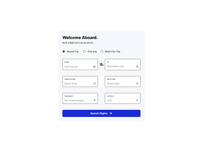
Daily UI Design Challenge 16/100 – Flight booking UI block
Hi Dribbble family,
I've developed a concept design for a flight booking UI block for an airline or a travel booking site.
Design process:
1. I've taken inspiration from the popular websites like skyscanner, airline websites like Indigo airlines, and Spicejet airlines.
2. I've identified the key text elements and input elements that needs to be included for the development of UI block.
3. The key inputs being, Hero text, caption to hero text, type of journey the end user intend to plan, starting point, destination, dates of journey, number of passengers, currency and a CTA button.
4. I've created components for input text, dropdown text, checkboxes and buttons.
To build this flight booking UI block, I've used the following
1. Fonts: Inter
2. I've used iconify figma plugin to gather logo for this social proof block design.
3. In my design, I've used design features and principles such as autolayout, alignment, and font size management to produce the design.
Love to hear your thoughts.
If you like my work hit «L» and follow me to join my 100 day UI Challenge
Thank you and Namaste 🙏
