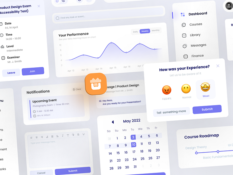
LMS UI Components | Case Study
About The Project
A learning management system (LMS) is a Web application that provides the framework that handles all aspects of the learning process and tracks your training process. The major purpose of this project was to design a simple and easy-to-use dashboard for all types of students who wish to complete various courses and prepare for a freelance job.
Wireframes
When it comes to layout or visual conceptualization, I always prefer to work with pen and paper, ignoring colours, typefaces, and other early and needless aspects. I began this project by sketching some ideas and then altering them to create the final and appealing layouts.
Low Fidelity Version
For me, low fidelity design is the ideal method to reduce extraneous elements while focusing on proportions and the most important factor - hierarchy. I don't spend much time on my layout because the wireframes from the previous phase have already been completed. In the low-fidelity version, I actually determine the importance and hierarchy of elements by giving them deeper colors and larger sizes, so that I could implement that importance in my final design using additional approaches.
Grid System
I used an 8 point grid system (and somewheres 12) to define dimensions, padding, and margin of elements. It provides a visual hierarchy to elements and drives consistent scalability with fewer decisions to make while maintaining a quality rhythm.
Color Palette
As the primary color, we chose Iris/80, a blue-violet hue. On the components, several tones of this color will be employed to establish it as a primary Identity aspect of the brand in the minds of users.
The orange hue is the polar opposite of blue, and it's utilized as a product's secondary color with a frequency of use of less than 10%.
We have divided the colors for Alerts and Notifications to assist users and minimize color misunderstandings. As you can see, we've assigned the Pink color to things related to online sessions and the Yellow color to practice notifications and other such items.
You can see another shot from this project, Here.
Online learning (LMS) Dashboard
Hey, Dribbblers 👋
This is my latest design for a Learning Management System (LMS) Dashboard.
Hope you like it!
I'll be happy to see your comments...
Available for new projects!
Follow me on Instagram/Behance to see more Logo Designs.


