Liverpool English Pub
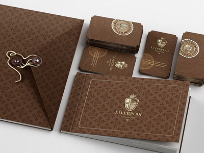
Each attribute is clear and bears the idea of historical honour and adherence to the traditions. ‘V’ letter of the inscription imitates bird’s wing, while ‘O’ letter was put on sales at all. The specific waves became a part of the coat-of-arms as well. Hence port cities with their busy trade routes and young people aiming to realize dreams have always been distinguished with a special flavour. The total image is fairly ornamented with crown to support royal spirit of Britain. The total identity creates atmosphere of comfort and though the style is deliberately aged, it doesn’t look boring; in contrast it is fresh and trendy.
More by Reynolds and Reyner View profile
Like
