Daily UI: Date Picker
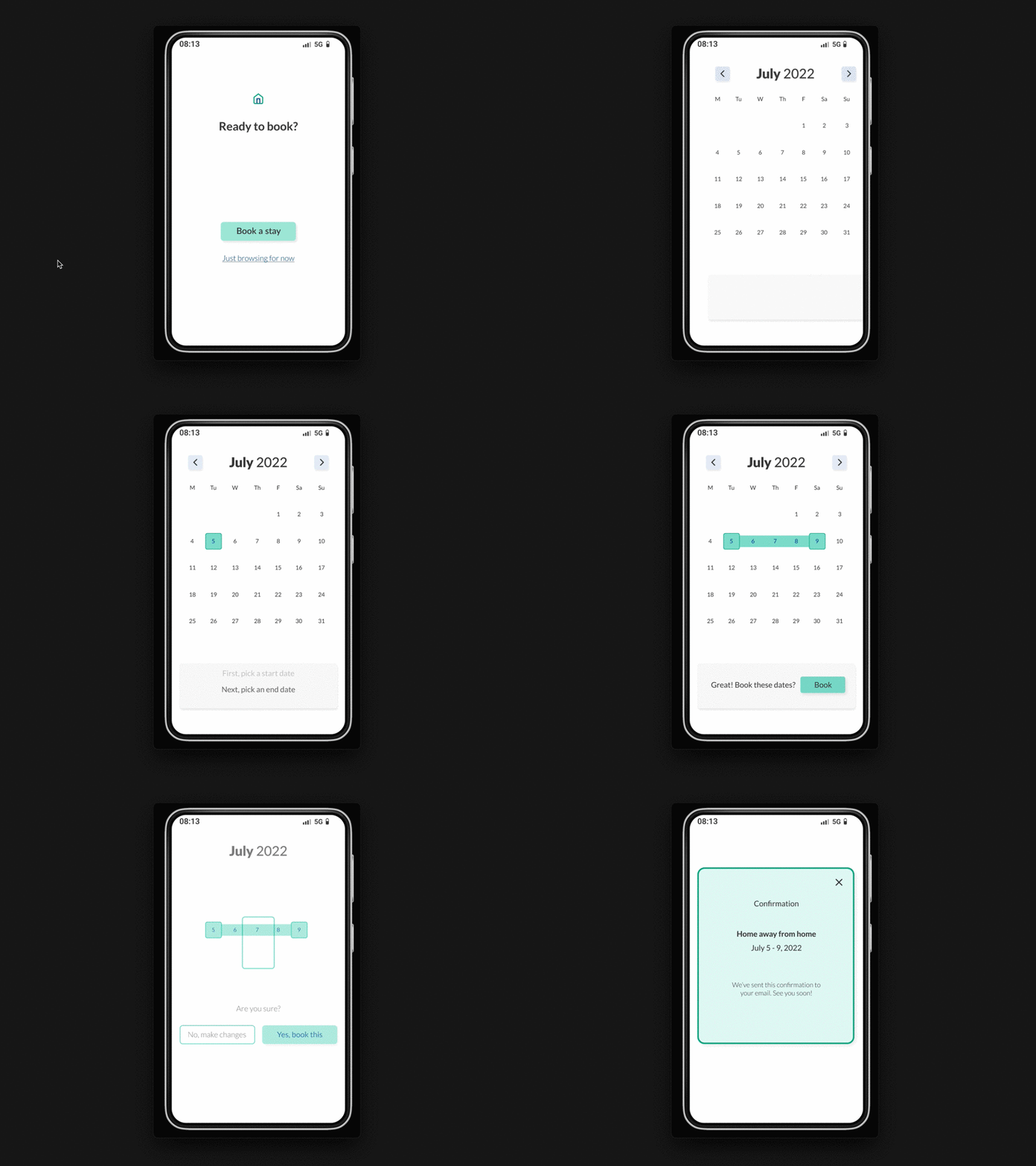
This animation focuses on quick and snappy motion, and I included some bounces to make the picker points feel fun. If I were iterating on this, I'd update the UX Writing on the confirmation screen from "Are you sure?" to something like "These are your dates" to encourage confidence. I'd also test whether putting the helper banner at the bottom or top makes a difference in user takeaways.
More by Max Blum View profile
Like
