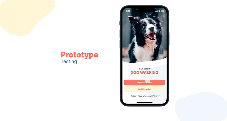
Fetched - Dog Walking App
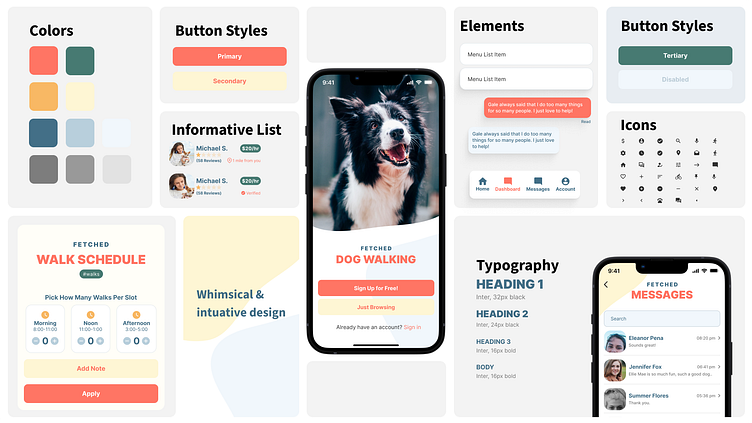
Fetched is for dog owners who can quickly and easily find affordable and well-trained dog walkers.
The market is full of dog-walking apps, so the challenge was to streamline the user flow from the landing page to booking. Considering different users was another point of interest that I wanted to explore. Fetched doesn't require an initial login and enables users to quickly start using the app.
See the Fetched Prototype in action.
The Problem
Dog owners want an app that solves the problem of searching for a trustworthy dog walker. Additionally, users place communication as a top priority. Dog walkers need to be reached through the on-boarding process, but also after the booking process. Real-time communication is a must-have.
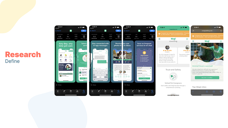
Research
I conducted face-to-face interviews to understand a dog owner's perspective. Most of the users mentioned that they would like to see an improvement in overall communication through the onboarding process. The interview also concluded that reviews and testimonials were a major factor in their decision-making process. If a dog walker even had one negative/critical review, this dog owner would keep searching.
Market
The market is full of dog walking apps. However, the top apps suffer from congested interfaces that impact usability. The goal of Fetched is to distill the process of searching for a reliable dog walker but maintain core features such as in-app chat and direct messaging.
"A genuine love for dogs"
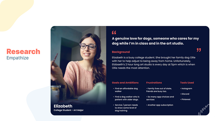
Persona
Elizabeth is a busy college student. She brought her family dog Ellie along with her to help adjust to being away from home. Unfortunately, Elizabeth’s 2-hour-long art studio class is every day starting at 5 pm.
Communication and affordability are two areas that Fetched is geared to solve for Elizabeth. In-app chat allows Elizabeth to raise concerns she has about leaving Ellie in the hands of a dog walker. Trust is gained through this process.
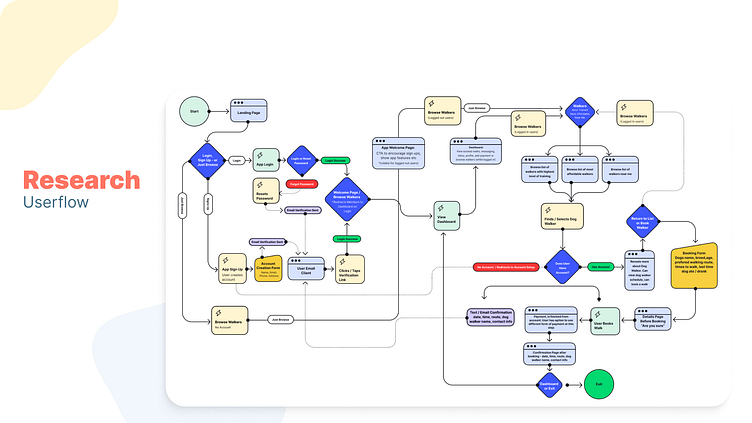
The Fetched user flow may seem complicated at first but the process accounts for 3 audiences. Current users, first-time/new users, and future users. As a consumer "Elizabeth" should be able to browse the service without having to subscribe or create an account at first. This way, "Elizabeth" can dive straight into the app. For security and privacy reasons it's important to note that users are required to sign up to interact / message dog walkers.
Ideate / Wireframing
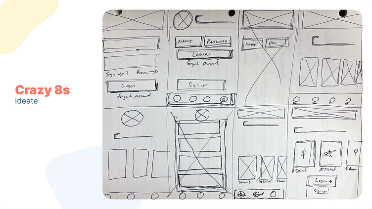
I love crazy 8s! I was able to quickly get ideas out of my head and on paper. Even though FigJam is a great place to wireframe, paper and pen seem like the best most natural method for me. Thankfully the design has evolved beyond these early sketches, but isn’t that the point!
My initial thought was to give users multiple ways to search for dog walkers on the first screen. The first round of sketches included a carousel of trending categories. A unique solution but I ended up looping back during the prototype phase. The experience wasn't natural and caused a bit of confusion during user testing.
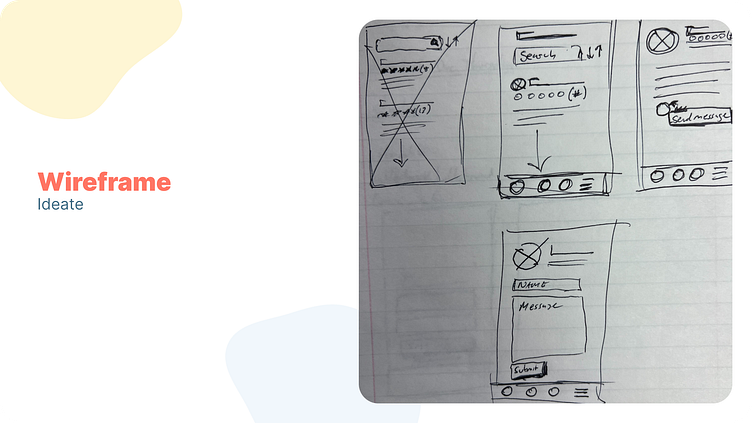
My background is in web design and development so my initial design choice was to create a web form! I’m happy to say that the design has moved into a more native experience. Don’t get me wrong, web forms work but for an app that needs to prioritize communication, a chat-like experience is the better approach.
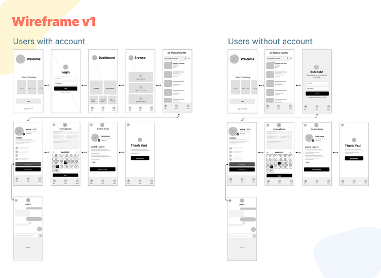
Fetched Version 1
The goal is to welcome the user, show trending or most popular search methods, and to allow users to jump in without signing up. The carousel pattern can include other “trending” search methods based on user behavior. User testing will be necessary.
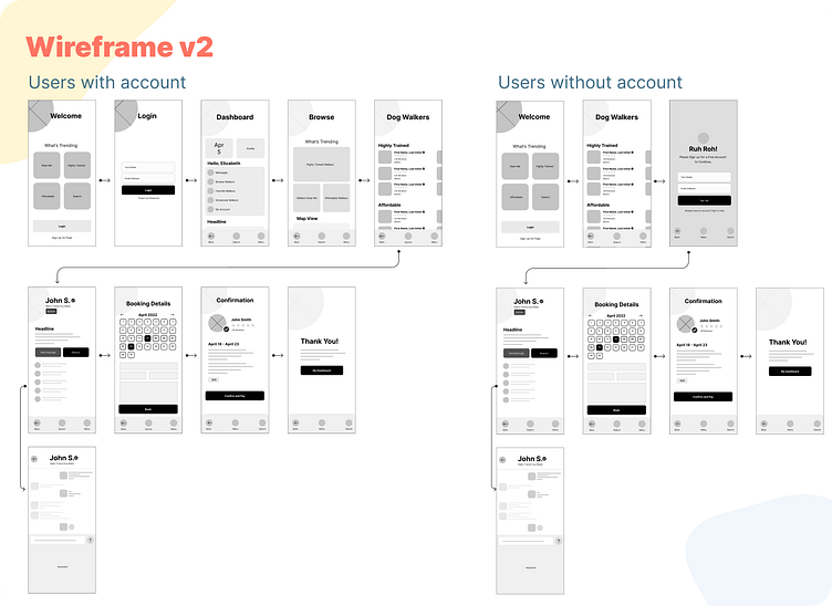
Fetched Version 2
The goal is similar to v1. Users should be allowed to jump in and search for dog walkers. The choice to create an account will be available through the flow. However, the on-boarding process uses traditional cards / grid patterns instead of a carousel which reinforces simplicity and familiarity.
Visual Design Process
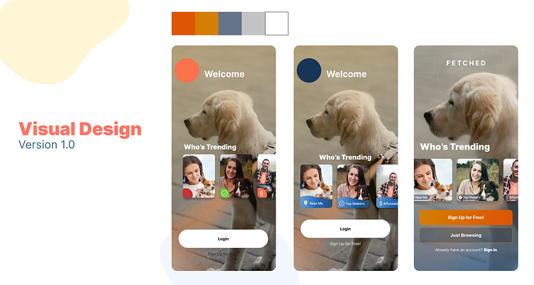
Visual design 1.0 was too ‘business/corporate’ according to some users during an initial reveal of work and simple wire flow tests. The color palette was not family-friendly and perhaps the image was misleading.
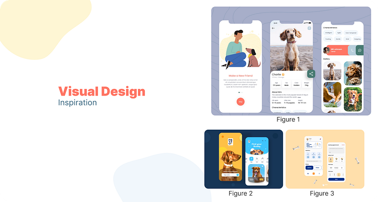
I quickly switched gears to figure out what could be improved. I was inspired by the natural colors of fig 1. Shapes and texture were the next area that would reinforce the friendliness of the design. Fig 2 and 3 provided that inspiration. The blob type shapes in fig 2 and the rounded corners of the elements in fig 3.
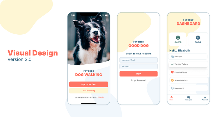
I wanted to keep a simple design and not overwhelm users with too much. The friendly color palette and grid-based layout were intentional to keep way-finding simple and intuitive. That said, several ideas required testing, and screens have evolved and changed. For example, the images below showcase design changes throughout the visual design/prototype process.
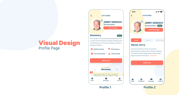
The design for profile 1 was adequate in terms of showing everything under one page, however it became obvious that I could improve the experience by using a tab interface. Profile 2 is an immediate improvement, breaking up content with tab items. The white space around elements / objects allows the design to breathe.
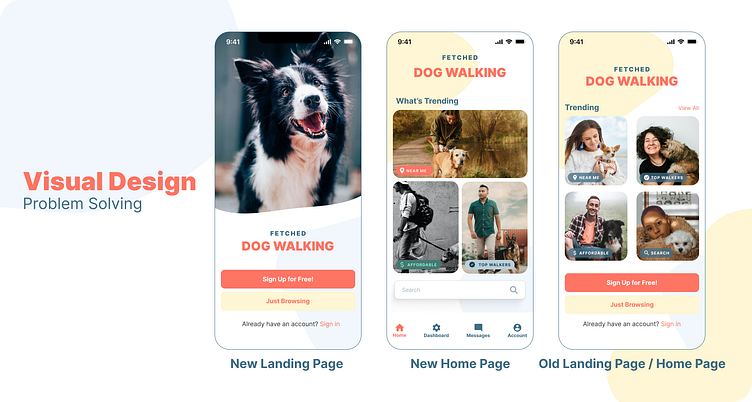
For users to quickly start looking for dog walkers I wanted to include a grid of trending categories. Test during the prototype phase revealed that the “Home Page / Landing Page” didn’t feel natural. Landing pages should be only visible on the first login. The updated landing page playfully utilizes the blob as a container for the image. The grid on the updated home page takes what worked with the old page but emphasizes categories with size, color, and category tags.
Prototype Problem Solving
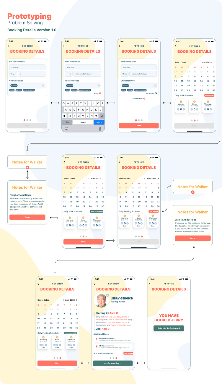
Booking Details 1.0
The booking process has gone through several iterations due to user feedback. V1 was very cumbersome and confused users by forcing them to add a note. In order to show my intentions to stakeholders or engineers this had to be resolved.
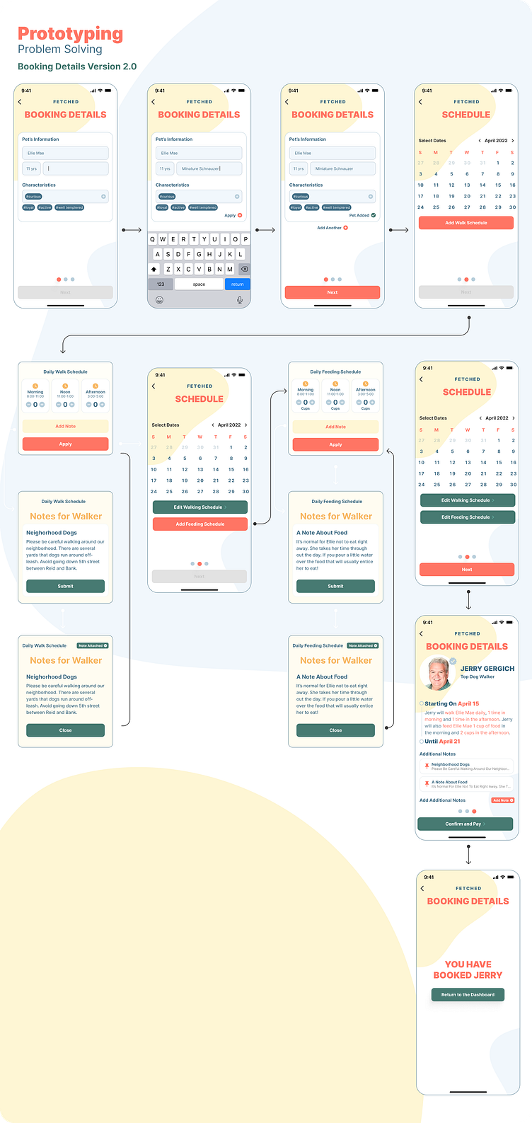
Booking Details 2.0
Version 2.0 of the booking process improved the user experience by including the “add note” choice. It was not required of the user to add notes and they could proceed through the flow more easily. Another benefit of this approach is utilizing overlay modals and swapping between other modals to contain this interaction.
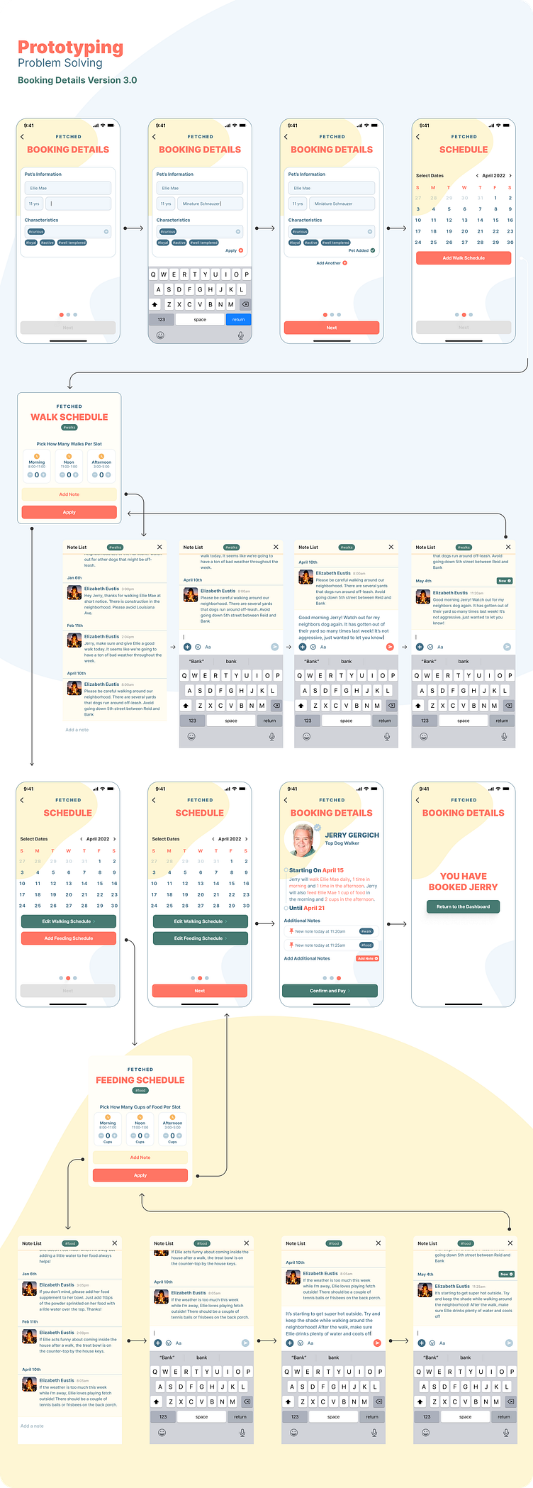
Booking Details 3.0
Version 3 of the booking flow improves the “note” adding interaction. I wanted the user to feel like they were direct messaging rather than posting a one-off note. Communication is very important for this app. To show a history of “notes” along with the ability for both the dog owner and walker to react to different notes adds a personal connection and collaborative touch.
The reason I avoided using the “chat” interface for this interaction has to do with the one-on-one type of experience. It’s supposed to be more personal and direct and not part of the typical app flow.
The chat/message interface is more for the discovery and potential booking of a dog walker.
See Full Prototype
Results
As each week of the course progressed I've become more confident as a designer and put every ounce of effort into this project. Figma has been an incredible tool! The design thinking process, Empathize, Define, Ideate, Prototype, Test, and Implement is now in the back of my mind any time I start to work on a project.
I want to continue to learn and push myself. From the very first time I was served the Dribbble ad, I knew this was something that I wanted to learn, and more importantly I knew that digital product design is something that I can do.
