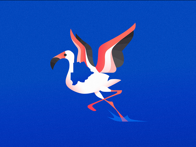
TBF 2 - Cleaner Version
I just imagined the previous exploration done in a cleaner style and, why not?
More vivid colors and more depth, specially at the wings, also I think the map pops up more!
Let me know on the comments what you people think about this one
Also I'm available for new projects, so feel free for ask me!
Need a logo, illustration or other crazy stuff? Email me now :)
Follow & Connect!
More by Breno Bitencourt View profile
Services by Breno Bitencourt
Like

