Training & Courses Site Web Design / Index
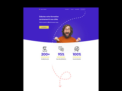
The client wanted a refresh and makeover for their business website. Their training courses are advertised to a predominantly young professional audience, so the colour scheme was updated to be bold and use high quality and light-hearted imagery to create a more exciting visual experience.
To help the user digest the text-heavy content, I used a dotted arrow as a visual aid to encourage the navigation of sections and help build a new visual identity for the brand.
- Laurie
More by Laurie Stanhope View profile
Like

