Bank Website Design
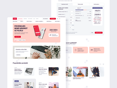
Website design for one of the largest Baltic banks was developed by our team.
It is based on a laconic minimalist design, with graphic elements and a strict but modern corporate identity.
Graphic elements create dynamics that dilute the generally strict component, while soft colors and fonts call for reliability and trust. In addition, a bright red color was used in the design, which makes the design more vivid, speaks of interesting solutions offered by the bank.
We paid special attention to the form of photo content and pictures. A non-standard approach, where we again combined calm soft shapes, warm photos but unusual angles, which makes the design unique.
In general, the design turned out to be laconic, serious and at the same time leaving a feeling of trust. Dynamic shapes and elements added to the uniqueness of the site, and the colors left behind a creative mood.
Looking for web design? Check our website https://green-pixel.com/ for more information and contact us: hello@green-pixel.com
