Rentree | Case Study - Icons
Happy Thursday, guys 👋
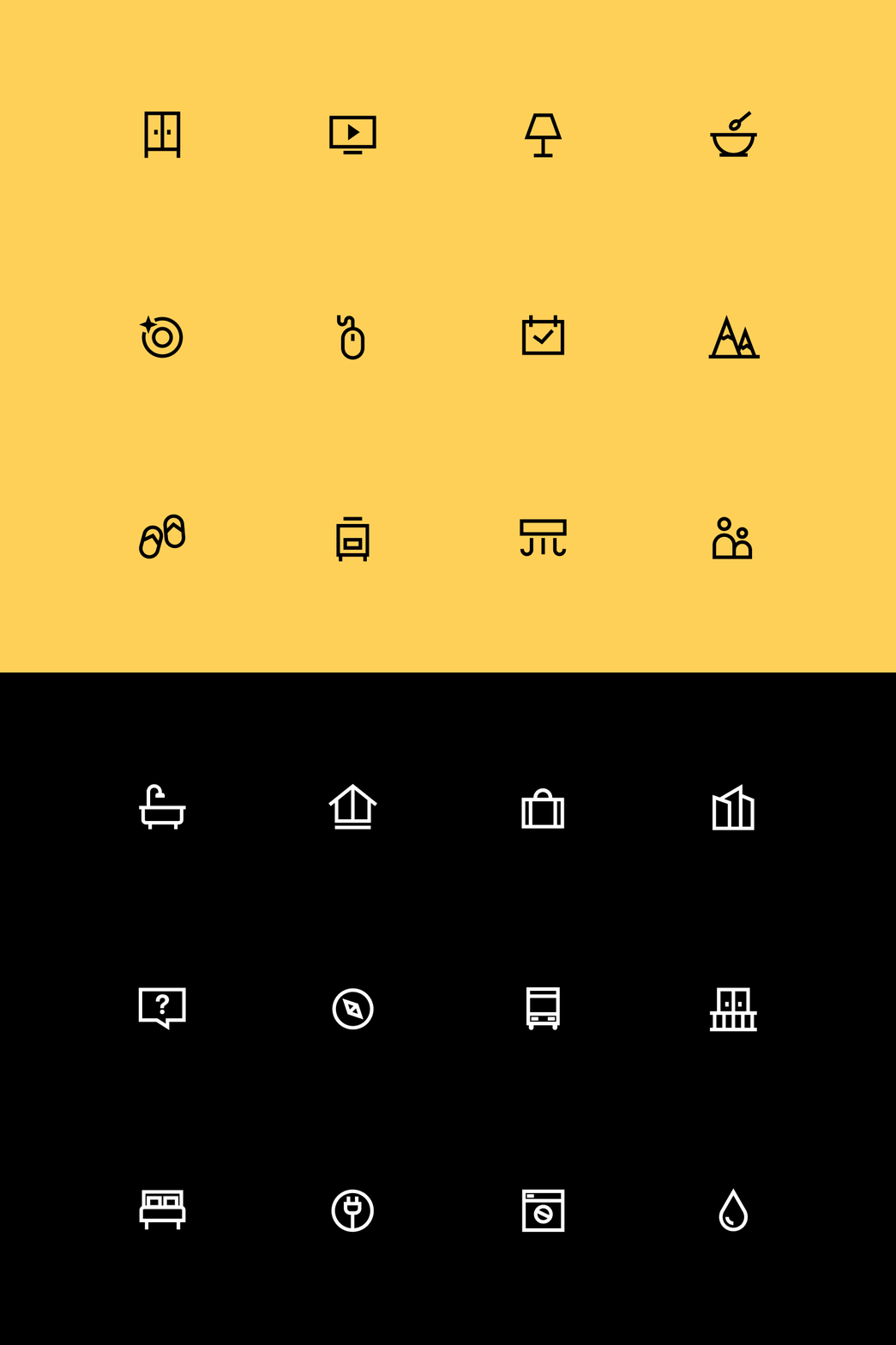
We continue sharing some pieces of our latest case study with you. Today we wanna show you the custom icons set we've created for Rentree.
Rentree is an expanding network of high-level and fully furnished apartments across Europe that are available on a subscription model. It’s almost like a long-term lease but better. Every Rentree member has a personal assistant that helps them if any questions or requests come up. The pricing model is transparent ad-free of extra charges – a monthly price already includes rent, utilities, Wi-Fi & TV, and even minor repairs. Rentree has been made for modern people who like the freedom of choice combined with a high standard of living and comfort.
As Unikorns, we’ve done everything from brand identity to the website as a final touchpoint with users. In terms of brand identity, it was very important for us to convey the feeling of naturalness and human-centric service. That’s why website and social media designs are light, simple to understand, and even use a wooden texture. People in their natural home environment are also an important part of the Rentree brand.
You can find a full case study here.
---
Get to know more about us on our website.
Follow us on Facebook / LinkedIn / Instagram / Behance
Have a project? Let's talk: hello@unikorns.work


