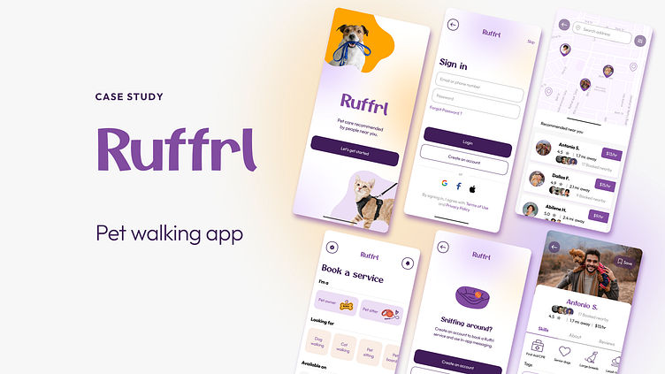
Ruffrl: Pet Walking App

Case Study Overview
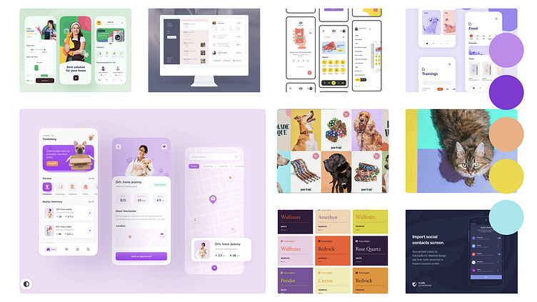
As part of the Dribbble Product Design Course, my first assignment was to create a dog walking app in Figma, from research through the implementation of a testable prototype. Ruffrl, pronounced like referral, allows users to view caretakers others have booked in the area near you.
Design brief
Dog owners sometimes need help caring for and walking their dogs. Create a service to connect dog owners with dog walkers. Consider how we can help dog owners trust their dogs are in safe hands.
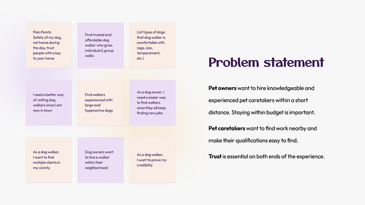
Problem Statement
Although the product design course allowed us to create individual projects, we collaborated on project goals and requirements with classmates. Recurring dog owner concerns included safety, experience, location, and most importantly trust. Potential walker issues involved advertising their credentials and showing available service locations. Although we created individual projects in the course, the class collaborated on project goals and requirements, which helped identify common pain points among our users.
Pet owners want to hire knowledgeable and experienced pet caretakers within a short distance. Staying within budget is important.
Pet caretakers want to find work nearby and make their qualifications easy to find.
Trust is essential on both ends of the experience.
User Research
I conducted phone interviews with two dog owners who downloaded current pet caretaking apps, Rover and Wag.
Primary concerns: Trust, caretaker experience, and skillsets
Secondary concerns: App ease of use, affordability
The first one preferred Rover. "I like how the interface is simple. Dog walkers rates are shown upfront, along with how often the walker gets repeat business," he said. The other participant noted her dog is large and has health concerns. "Walkers need to know how to walk a dog her size, and if I leave her with someone I don't know, I'm risking that they know how to give her medication," she stated.
Market Research
As I browsed Rover and Wag, I noticed how they cover similar services yet take varied approaches.
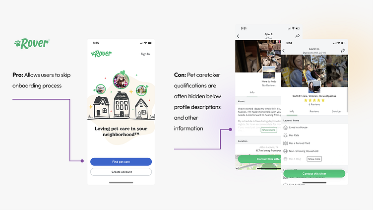
Rover
Users can skip Rover's onboarding process and begin browsing services right away. After selecting a pet service and adding dates, a long list of available pet caretakers appears. While the caretaker profile page contains a plethora of information, the layout is cluttered and varies by individual. It's difficult to find information, as credentials are often buried under a profile section or icons representing the person's home.
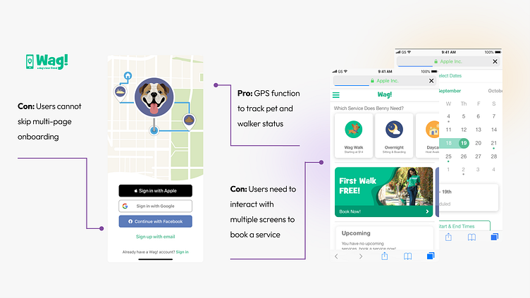
Wag
Opening the Wag app was far less engaging to use from a research approach. Users can't skip the multi-page onboarding process, meaning you have to create a profile and answer several questions about pet needs before you can browse services. After creating a profile, users must again go through a multi-page process to select a service.
Key differentiator
Although this project is specifically geared toward creating a dog walking app, most pet caretaking apps offer adjacent needs, including sitting and boarding. However, I noticed that one service is conspicuously absent: cat walking.
My cat Gavin is harness trained and loves exploring the outdoors. I decided that my case study app would offer walking services for harness-trained felines.
User persona
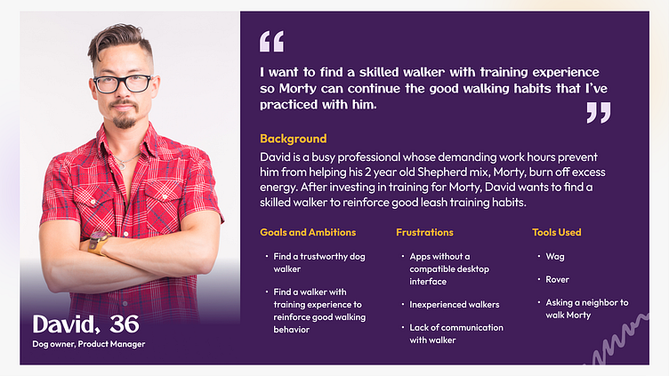
My user persona reflected a mixture of my phone interviews, considering what what they look for in a dog/cat sitter walker and sitter.
David's motivations are built around trust and quantifiable qualifications. Working around a busy work schedule, he wants a seamless app. David believes he should be able to select a trustworthy and experienced walker. Communication between the user and the walker should be simple and easy to find.
User flow
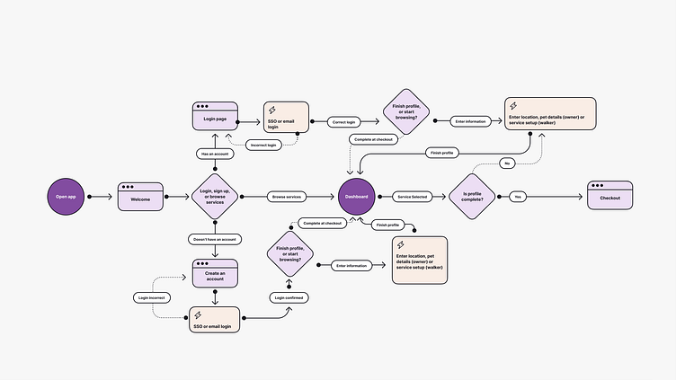
View the onboarding user flow in Figma.
For this project, we created a user flow focused on app onboarding. I aimed to design an onboarding flow that would work for David, meaning he could browse services without a commitment to sign up.
Unlike Wag, users can browse available services commitment-free without requiring payment information or personal details. When users are ready to purchase a service or sign on as a dog walker, the prompt to add location information appears.
While Rover allows users to browse services, it's unclear how far you can delve into making an appointment before you need to create a profile. In the later prototype phase of this project, I added a Skip page that outlined how users would need to create an account to book a service and use in-app messaging.
Wireframes
After creating the onboarding, next came planning the services page, caretaker search, and walker profile pages. How could I help owners trust the walkers? What could I show on the search page or profile page that could be a trust signal?
Initial sketches

My first sketch on ruled paper focused on ways to show caretaker profile cards in the app and give the users visual indicators for location and ratings, as well as a Save or Favorite function for users to find preferred caretakers again with ease.
The second iteration considered various approaches for selecting services in the top row. The second row would become the preferred method of conveying quantifiable information in a caretaker profile: icons. When users select a profile, the most prominent information listed are skills and specialties to build quantifiable trust with users.
Figma wireframes
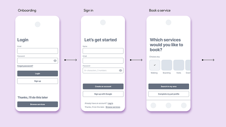
Onboarding allows users to create an account or skip to start browsing services.
Book a service features a horizontal scroll to create whitespace. Users can search for services or complete their pet profile before searching.
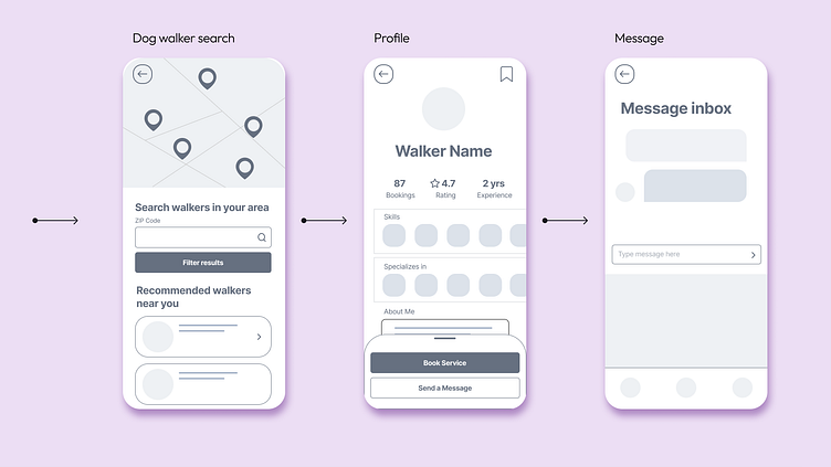
Dog walker search prompts users to type their ZIP code and filter results for recommended walkers, whose profiles appear below.
Profile is built similar to rideshare apps. Pet caretakers can display a small profile photo above their booking numbers, rating, and experience. Quantifiable information is forefront below, represented by small icons.
Message lets users reach out with questions before booking. Early iterations included an area below chat function for frequently asked questions to prompt users or highlight an issue that requires attention from the app.
Visual Designs
Mood board
My favorite concepts were fun, vivid, and modern while allowing enough whitespace for interactive elements to breathe. To distinguish my cat walking-friendly app from other dog-centric apps, I chose to prominently feature a cat on the splash page.
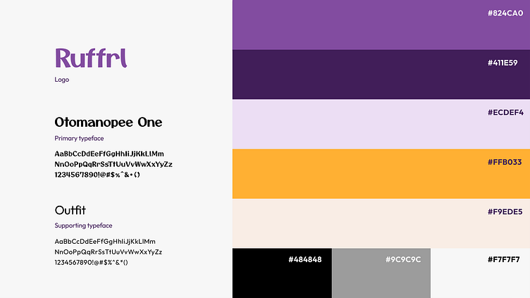
Typography and color palette
To distinguish from the spring green branding of Rover and Wag, I decided to go with a range of purples with marigold and peach accents. Round, playful typefaces Otomanopee One and Outfit complement the soft graphic shapes, rounded button corners, and blurred gradients I included in my design. Together these elements create a playful and inviting visual identity.
Welcome to Ruffrl
I named my app Ruffrl, pronounced like referral, based on the premise that users can view pictures of account holders in their area who have booked each walker. This aims to increase trust between walkers and customers, as well as link neighbors together by showing who has booked walkers nearby.
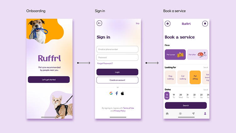
Onboarding and Sign in didn’t stray far from my original wireframe, where users can skip sign-in at the top right of the page and go to Book a service.
Book a service aims to be a one-screen interface so users don’t have to spend time scrolling between different screens before they get to book.
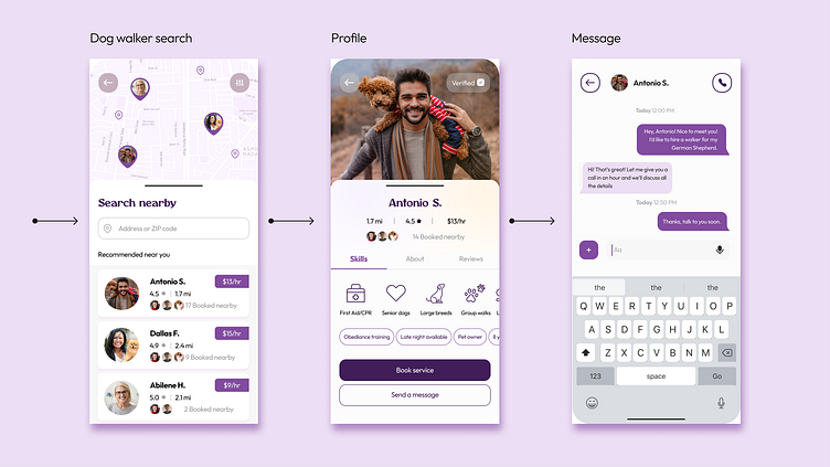
Dog walker search has the GPS map on the top of the page, with the search function below and recommended walkers in a vertical scroll area with a collapsible tab. Each walker's card contains their rating, distance from the address entered, hourly rate, and the pictures and total number of account holders in their area who have booked with the walker.
Profile displays the a prominent photo of the walker, distance, rating, hourly rate, and users who booked nearby. Below, Skills include two sections: quantifiable skills that are available with icons, and additional descriptive tags that users can customize. This highlights Skills rather than showing users an About section first, which I find cumbersome to browse on the Rover app. Additional tabs for users to browse are About, which would contain a written biography, and Reviews.
From here, users can book the walker's service, send them a message, or go back to the search page.
Message page has the option to directly message or call walkers to ask questions about their services.
Components
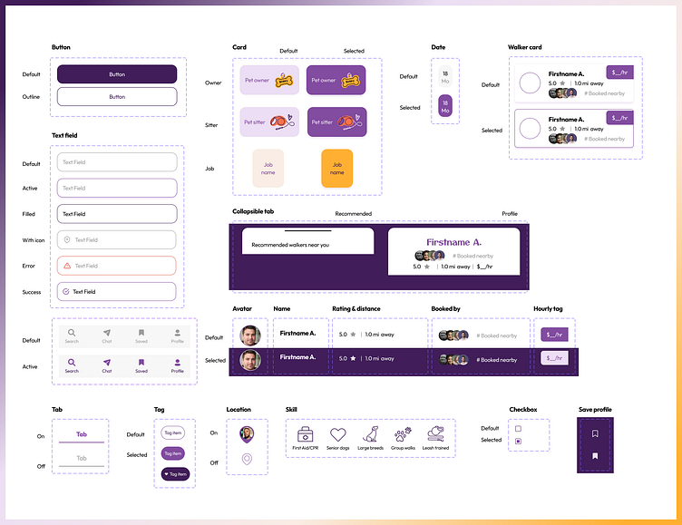
Buttons, text fields, dates, and cards are standard interactable fields using the branded colors and typefaces.
Walker cards, collapsible tabs, and various walker profile components standardize the layouts for search results and profiles.
Location shows the on state with a photo when a walker card is visible under Recommended near you. The off state indicates available walkers are off-screen.
Save function allows users to save walkers they would book in the future.
Skills are pre-made icons conveying pet caretaking experience. Skills show one of the two ways that walkers can list their quantifiable assets.
Tags are additional descriptions not conveyed in skills that walkers can customize. In concept, users can select one or more tags on profile pages to save that tag to their profile for other future searches.
Reflecting on these designs in an expanded version of Ruffrl, I would seek to build out the skill icons into a full library of 15-20 icons representing standard pet caretaking expertise.
Prototype + Test
I conducted two rounds of usability tests on Ruffrl's interactive prototype. This mainly tested the onboarding flow, searching for a dog walker, and using the back arrow commands.
View the prototype in Figma and the final design below.
Final design changes
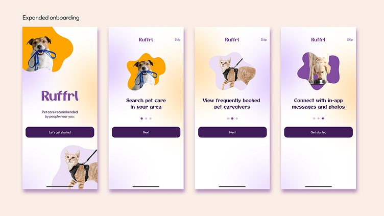
Onboarding was expanded to include an introduction explaining how the app worked. Users can read three slides on how Ruffrl works featuring pictures of cute animals with branded elements, or skip and go straight to book an appointment.
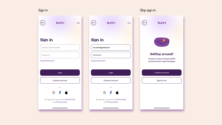
Sign in includes a version in the prototype that shows the user information filled in.
Skip sign in is a new splash page that appears when users choose to skip sign in. This explains that users will need to create an account later in order to book an app or use in-app messaging. This creates transparency of what browsing users can expect from the app while supporting my original goal of anyone being able to browse services without needing to create an account first.
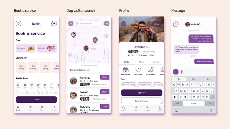
Book a service dates now has a default state with a light gray background. Testing feedback showed that users wanted a more significant visual indicator for the horizontal scroll area, similar to Looking for. I also added checkboxes for time of day so users can see available pet caretakers in their preferred time slots (A.M., mid-day, P.M., or overnight).
Dog walker search has the search address bar to create a seamless view between the map and Recommended walkers. I also changed the Verified check mark at the top right back to the Save function, as I envisioned in my original sketches.
Profile removed the Verified check mark at the top right from the previous version and reinstated the Save function from my original wireframe sketches.
Message removed the call function, as this may be seen as intrusive by pet caretakers.
If I were to test with more users, I would expand the walker profile page to include testable tabs for About and Reviews, as well as build out the user profile dashboard and payment options page. I would also like to create a page about how all pet caretakers are verified by Ruffrl in order to build trust with users.
Outcome + Results
As a pet owner, creating a dog walking app was an exciting entry point into product design. Understanding user needs for trustworthy pet care came easy to me, and the desire to build clean, modern interfaces sparked a special interest.
The areas of my app that I felt were most successful were the visual identity, onboarding, and quantifiable skills on the walker profile page. Ruffrl has a distinct function that values finding a pet caretaker quickly without requiring users to create a profile, viewing real people who have booked caretakers, and scanning walker qualifications with the use of icons.