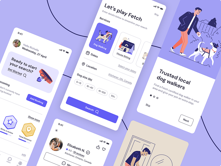
Fetch Dog Walking App
Fetch is an application designed to help dog owners book a dog walker, house sitter or board their pet seamlessly.
Challenges with booking dog walkers
Dog owners have difficulty trusting dog walkers. Some may not take their pet out at all at their scheduled time, or have the proper certifications. Below is a crafted persona based on some of these challenges to better identify with the user.
User Research
I gathered research from pet owners and online forums such as Reddit to gain an understanding of some areas of success and opportunities when using current dog walking applications.
User Flow
The main focus of this flow is to allow a user to book time with a dog walker. In addition, give them the opportunity for an interview to get to know their dog walker and build trust.
Wireframes
Below are some examples of the various screens required for the search function. I decided to incorporate elements from multiple screens to achieve the right balance of necessary information without the visual design being too cluttered.
Visual Design
The visual design philosophy of Fetch is approachable. Leaving your pet with a stranger can be stressful and a little scary. The goal with the brand is to minimize those fears and leave the user with a sense of comfort.
User Testing
When testing the Fetch prototype there were a few areas where the participating users had difficulty with the booking process. The ability to change the date was not as visible or clear as it should have been. There was also too much finality for the word "book" to book a dog walker. The user wanted to contact the walker before committing to a date.
Prototyping
Awards are given to the user for using the app to promote booking and daily dog exercise. Try out the flow for yourself!
Onboarding and sign up flow. Try it out for yourself!
Dog walker search flow. Try it out for yourself!
Key Takeaways
Creating this application displayed a few barriers for my users. The main one being the ability to change their selected date. The other barrier being UX content writing.
This prevented the user from moving further and not completing the task. This was overcome by providing multiple options to switch the date. The language used was another barrier.
Language that was too final conflicted with the user research. The ability to interview a dog walker was key before proceeding to book them. Changing the word from "book" to "reserve" or "schedule" resonated with the user and allowed them to continue without hesitation.


