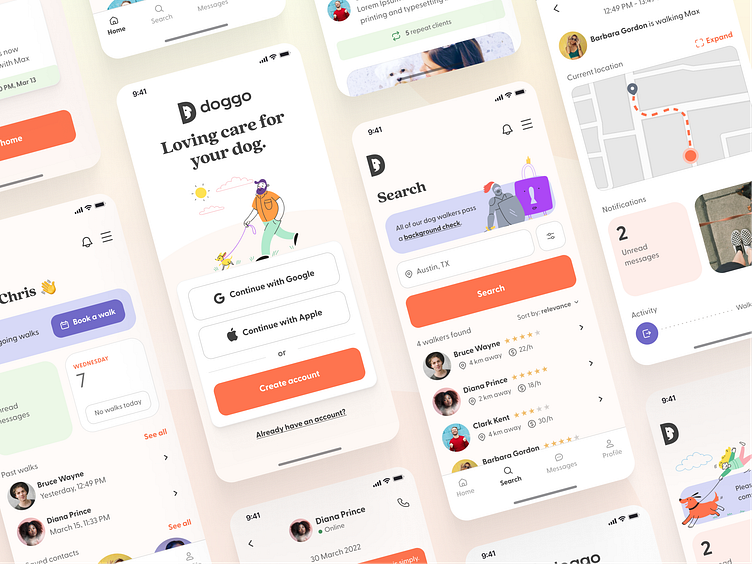
Doggo - dog walking service app
Hey dribbble 👋
Sharing the process of designing Doggo — a mobile application offering on demand and scheduled pet care services with local pet caregivers, who offer dog walking.
The problem that Doggo had to solve was simple - offer an alternative to dog owners, who don't have enough time to care for their pets.
My role on the project was to conduct market and user research, and based on those findings to deliver a design concept that would form the whole service all together.
In this case study, we will see how we went from the discovery phase to ideation, iteration and solution delivery.
Discovery and ideation
The first steps we took was to define the problem our potential users were facing, their pain points and to conduct market research in order to validate Doggo's business goals.
Our research showed that there was a substantial increase in pet ownership and pet spending in the past 20 years. However there was a clearly identified problem, that clashed with this increase in dog owners - there has also been an increase in working hours. Which in turn generates a growing search for pet caring services.
With our problem defined, the team conducted interviews with potential users in order to establish what their pain points are, and based on that information we had a brainstorming session which identified a few common threads when it comes to pain points. We threw around some ideas on how those should be addressed. 👇
The next step was to gather all of that information and define our user personas. Those are fictional users that best represented all of our findings and would help us deliver a functional design down the road. 🧍♀️🧍♂️
With all the information now compiled, I started laying out the initial user flow for the app. And based on that user flow, I created a set of wireframes that helped test and validate the ideas we had for possible solutions.
Less talk, more design.
After the initial testing of the wireframes it was now time to put on my designery* face and get into pixel pushing. 😎 I gathered ideas and inspiration on a moodboard and I was off to the races.
*that's a word I promise
The goal as we understood from our research was to come up with an intuitive interface, that felt reliable, but had that human touch also. So the typography, colors and other visual elements had to introduce both playfulness and the professional/reliable vibe we needed.
The tidbits
Here are some more details around the design, including a component library, typography and colors. And last but not least, when designing the logo I kept at the back of my head that it needed to translate well into an app icon, so there's that as well. 😁
Thank you for your attention, hope you enjoyed my little case study, much love ❤️


