Thanking Paws - dog walking app
Thanking Paws is a beginner friendly dog walking app with a purpose to serve people who are not very familiar with using mobile applications. It is a simple app that gets one job done at a time to minimize unnecessary confusion by the user.
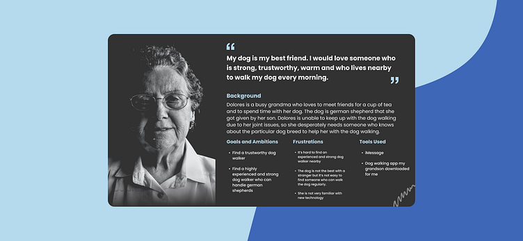
User Persona
Problem Statement
Based on the user research & persona analysis, the following problems were identified.
1) The current apps look too busy and the contents are hard to read. For example, there are too many colorful images and the texts are too tiny
2) The user only wants to focus on one or two tasks per session, but there are too many options offered per screen that confuses the user
3) It’s hard to find a trustworthy dog walker specialized in walking large dogs
My Role & Proposed Solutions
My role was to design an app that anyone with a smart phone can easily use to achieve their goals without getting confused about the app functionalities.
The proposed solutions are as follows.
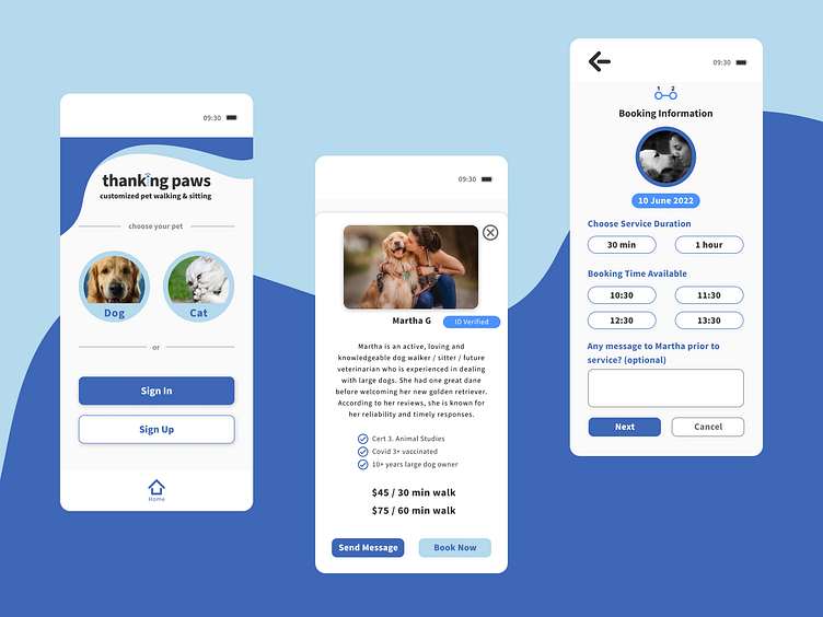
1) To make the app simple and easy to use, less images will be inserted, the fonts will be enlarged when possible and only two available dog walkers per screen will show
2) To mitigate user confusion due to multiple tasks being presented on one screen, the app will focus on solving one problem at a time per screen
3) The app will filter out the dog walkers at the pre-filtering stage, and only the dog walkers experienced in walking large dogs will be shown within the user’s postcode (zip code) area
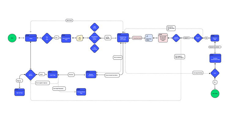
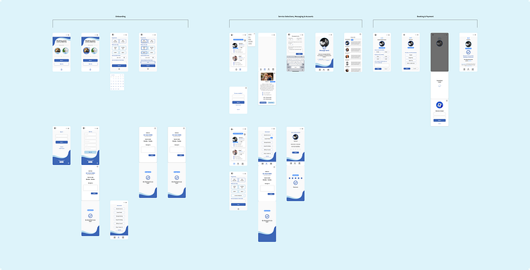
User Flows
The initial process was to capture the user’s on-boarding journey. To understand the overall picture, I wanted to understand briefly how the user flows play out from on-boarding to payment.
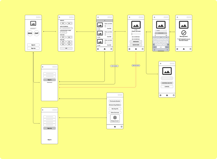
Low-Fidelity Design & Wireframing
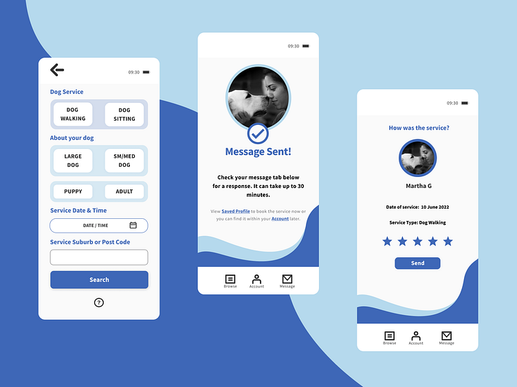
The font sizes are minimum 14 pixels for normal text. The app also minimizes typing by the user as much as possible unless it is absolutely required such as sending an important extra message to the dog walker. The decision regarding app features became more concrete after drawing the second wireframes.
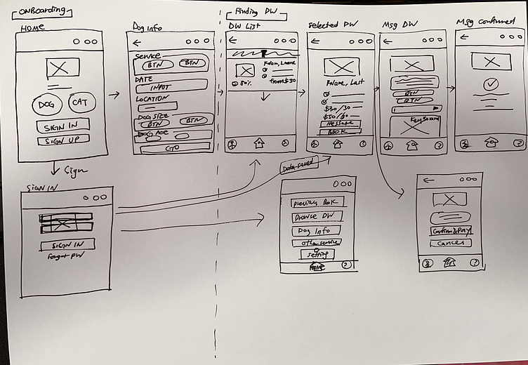
Style 1 : This was the initial stage for forming the main functionalities per screen. Except for the home screen, most of the design decisions have been deviated from this design, but this provided a good baseline for the next idea.
Style 2: A further development from the initial design was established during this stage. The overall design looks closer to the final design.
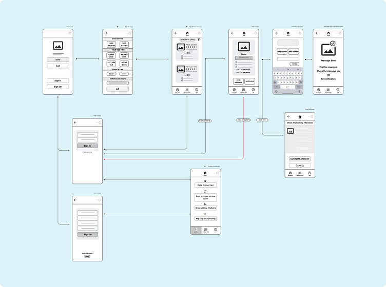
Making two different styles of wireframes allowed me to generate diverse UI design ideas throughout the process. The outcome incorporates the design mixture between those two wireframing stages.
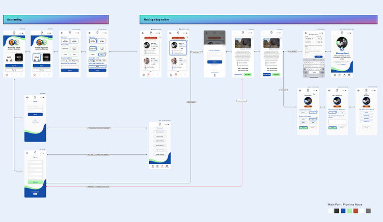
High-Fidelity Design, Prototyping and User Testing
Initially, the main contrasting colors were blue, green and dark orange as shown above.
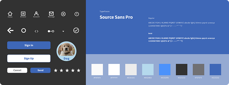
Later on, the colors were changed to different levels of blue as I realized the chosen green and orange didn't really fit well with the rest of the elements on the screens. Also, with accessibility in mind, not using a bright green was a better choice. The typeface was also changed from Proxima Nova to Source Sans Pro.
After several adjustments including changing the main color theme, payment progress bar, button designs, trimming of messaging and booking screens, the prototype for Thanking Paws was ready for user testing.
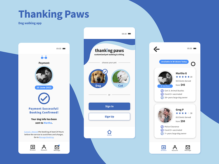
The Design Solutions & Outcome
The design decisions were made based on the proposed solutions.
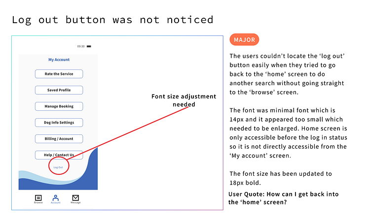
The app considers accessibility, and it offers a good color contrast between the texts and the background. A help button is accessible via multiple screens in case an inexperienced user gets stuck or has any questions during the course of using the app.
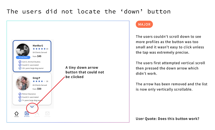
After the pre-filtering stage (before showing the list of available dog walkers), the user gets to tackle one problem per screen rather than being presented with multiple options not related to the core function. The dog walker list also limits two dog walkers per screen, and the list can be vertically scrolled by hand.
Based on the iterating process of testing and re-designing, the overall sentiment on this app was that it offered some interesting solutions catered to users with less app-handling experiences. Of course, there are more improvements to be made such as simplifying the signing and payment stages in future.
The whole journey of making this app had challenging moments, but I also had fun designing this app from scratch.
Please see the prototype for a more detailed interaction experience.