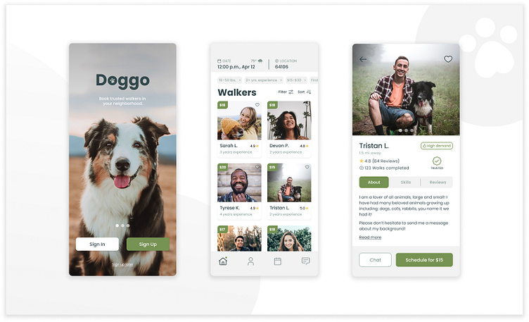
Doggo: A Dog Walking App
Role: UX Research, UX Design, UI Design
Timeline: March – May 2022 | Tools: Figma, FigJam
With some resemblance of normal life resuming, people are finding themselves stretched thin with their schedules. One area of daily life that is being squeezed by that demanding calendar is time spent with our furry family members.
Whether you are a busy family with all of the extracurriculars, or simply can’t be home in time to enjoy the nice spring day, Doggo gives users the ability to find trusted dog-walkers based on location and provides a simple platform to review and find the best match for their pup. Doggo users will have the option to book a one-time walk, or if they are enjoying the peace of mind knowing their furry-friend is being exercised and taken care of they can set up recurring walks.
Research
After defining our problem, research was the necessary follow up. This consisted of market research and analysis, design research, and—most important—user research. Working backwards, I wanted to know more about users and their pain points that when using other service providers, thus I conducted a user interview.
Based off of the interview, the following persona was created:
Process
The main function of the app is to book a walk, and I wanted this to be designed in a simple and effective way for the user to get that task accomplished. I created a user flow that would move them forward with each step, starting with a simple prompt that sets them up for success.
Before spending too much time on design aesthetics, I developed three iterations of wireframes. This allowed me to focus on the function and flow of the app first. Using FigJam and Figma, the interface evolved from sketches to lo-fi designs.
After creating multiple iterations of wireframes, I narrowed in on what design elements could aid in successful paths to booking a dog walker and began building out visual designs. With the help of some peer reviews, I was able to make some improvements to the screens.
This included:
Editing repetitive data on the walker dashboard
Making sure typefaces were a readable size
Carrying over metadata from the walker cards to their profiles was essential in showing consistent information so that users didn’t have to return to any previous screens
Design decisions: based on the user interview revealing privacy concerns, including multiple skip actions was vital. Allowing the user to skip to the walker dashboard to begin browsing walkers in their area helps accomplish concerns about inputting too much information before building trust.
Keeping the booking data at the top of the screen was vital, this allows users to set their time and date at the beginning of their browsing search, automatically filtering availability. A highlight here was showing the forecast for that day. A lot of interruptions to getting your pup out of the house are weather-related.
Check the prototype out below!
Conclusion
This entire process was a great building block on my path as a product designer. Being able to utilize the essential steps of the design process to create Doggo was transformational. Conducting a user interview was extremely helpful in understanding the product from a different perspective. Being able to translate that information into design and business goals is a key piece of the process.
If I could change anything about the process I would conduct a few more interviews to gain more information about potential users and translate that into a well-rounded persona. Also, I would create a few more screens within the input and filtering areas of the design flow.
Overall, I am very pleased with where Doggo ended up. My goal was to grow my UX fundamentals and snowball that to purposeful visual design, and I feel that I accomplished that.
✅ I'm open to work! Let's connect on LinkedIn


