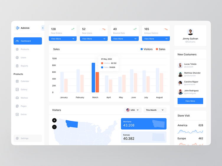
Admin Dashboard UI Concept
Hi Folks!
Here my new exploration of Admin dashboard UI Design. I called it Adminin. Combining Orange & Blue to make it fresh and clean. I create it from wireframe to High Fidelity Design. Want to know my process to create this? You can scroll down slowly to make it easy! Cheers 👍
Wireframe Process
I did 2 explorations on the wireframe process. First I tried to use a wave chart for sales statistics, but I change it to a shape chart to make it more easy and clean.
Wireframe 1
Wireframe 2
Design Guideline
Final touch!
Finally, I put my design on a Macbook Pro mockup to see how's it looks like when it's going live. And I also put a sidebar option when it's on minimized & maximized conditions.
Interest to partnering with us? Say hello at hellodama@odama.io or visit our website odama.io
Check us more at:
📷 Instagram | 🛒 Gumroad | 🎉 Figma Community | 🛍 Creative Market


