Daily UI #009 - Player
Went with a simple music player design.
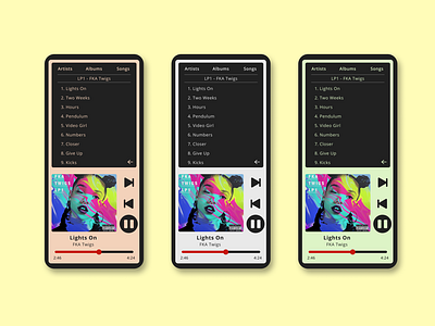
Two things driving this design: I wanted to offset the controls, mainly because all players center their controls so I just wanted to do something different. Then I wanted a retro feel so I drew inspiration from old iPods. I went with that idea purely on feel and memory, i.e. I didn't look up any iPod designs.
The iPod idea was continued with the color options, except I chose low saturated colors as this is much easier on the eye than vibrant colors.
I wanted the music navigation and the current playing song accessible at the same time to reduce the need for users to switch between screens.
I placed the navigation back arrow in the bottom right corner of the navigation section to have a cleaner design, as the top section is desirable real estate, and the bottom right corner is going unused.
The album art is not the original album art, but a design by Halle Rasco, which I found here: https://www.behance.net/gallery/28880743/Album-Artwork
