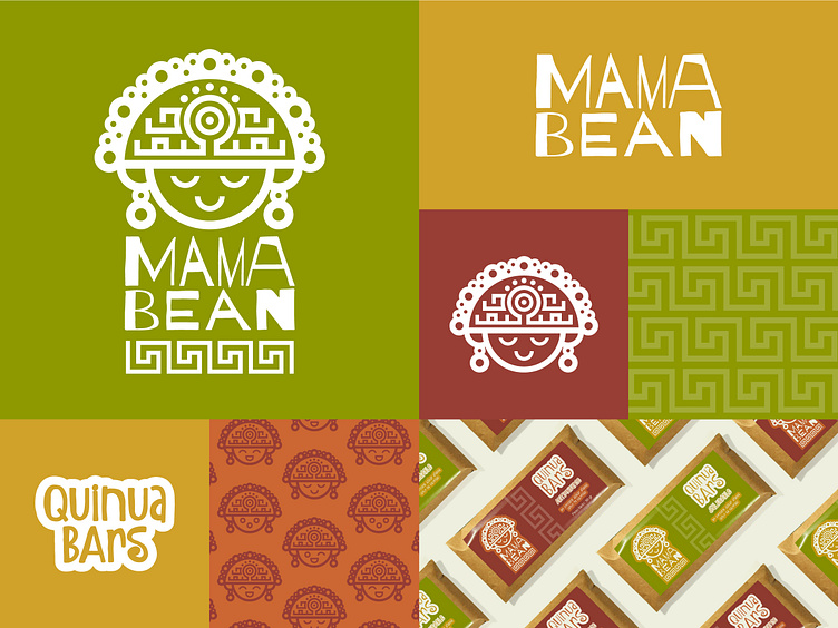
MAMA BEAN — Brand identity
The goal of this project was to create the logo and packaging design for a line of supplemental bars that would appeal to health-conscious consumers. The bar was designed to be a healthy alternative to candy bars, with a focus on high-quality ingredients and a rich taste experience.
The proposed name for the bar—Mama Bean—is an homage to Quinua, which has a spiritual meaning for the Incas, who refer to it as Chisaya Mama: “Mother of all grains.”
For the logo, I created an abstract representation of a traditional gold Inca figurine out of geometric shapes that could be used in both black-and-white and full-color versions.
I used an earthy color scheme, including tones like browns, greens, oranges, and yellows, chosen to reflect the natural origins and quality of the product, while also presenting the brand as approachable and friendly—something you would want to eat every day.
The package was designed with sustainability in mind. Natural colors and materials such as kraft paper were used so that the look and feel were consistent with the product inside. It also uses minimal amounts of plastic packaging materials.
_______
For more of my work: jenngodoy.design
