Document Design - Agency Brand
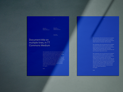
For the agency I work at, called iO, I was allowed to design the branding a year ago. Part of this branding was, of course, how do documents look? The blue version never made it, because who has blue paper lying around? :D The second image and document was actually created and used, and was a summary of a survey to designers, about what tools they are using.
The orange graph on the front instantly communicates what the document contains: data and graphs. The second typeface used to highlight the important words in a title, highlight what the graphs are about: Tools that designers use.
More by Mark View profile
Like

