#11 Dima Kreminskiy | UX/UI Designer | Interface for Day Zero


Test task completed — April 25, 2022
Contact — @whykream (telegram)
Portfolio — https://www.figma.com/file/Y2mvShlCflC84eG1LQOmFl/Portfolio?node-id=0%3A1
Our comment:
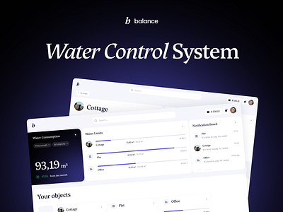
I liked how the interface looks in general; it's light and not overloaded with colors. The users' attention is captured by the block with water consumption. It has a good accent, but further down the page, everything merges, there are no accents, and there are many holes. Some compositional decisions in blocks and spacings are not clear. Consumption statistics are scattered around. The functionality is repeated on the same screen. The work on typography is not good enough. A serif font looks good in large sizes, but it's not readable in small sizes.
