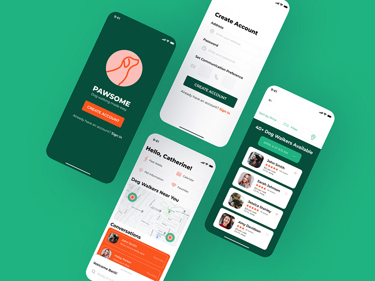
Pawsome Dog Walking App
Hello👋👋
As a part of Dribbble’s Product Design Course, we were tasked with creating an app that connects dog owners with dog walkers. My role in this project included,
Defining the problem
Conducting user and market research
Developing user flows
Creating wireframes
Applying visual de
sign
Prototyping and testing
What's the problem?
Dog owners are busy and need additional support when taking care of their pets. The market is full of pet walking apps, so we first needed to determine pain points dog owners experience with other apps.
The most common pain points revealed through in-person interviews included the amount of time it took to book a walker, overall trust and the dog walkers experience.
With these pain points in mind, I conducted market research to determine if these apps offered any solutions to the commonalities expressed above. Though there were several great features, nothing effectively ensured instant booking with a trusted walker.
How do we solve for these pain points?
Together we discussed our research findings and brainstormed potential features that could be incorporated to alleviate some of the paint points for dog owners.
Who is our user?
Several user personas were developed. This helped generate ideas and functionality needed for the end user. I focused on Michael, a small business owner. Michael has long days and unexpectedly gets tied up at work a few times a week. When issues arise, he needs to feel confident that he can quickly book a dog walker and doesn't want to compromise on the care his pet receives.
As I began laying out the initial user flow, my goal was to eliminate the tedious process of browsing through hundreds of dog walkers that potentially wouldn't be available on the proposed date. I wanted users of this product to have peace of mind knowing search results would be catered to their needs, specifically date and time, allowing dog owners to quickly book a walker.
Things Got Crazy...
doing Crazy 8's! This process allows designers to quickly get several ideas on paper (whether they're good or bad). I explored different options to accommodate a quick booking process.
During my first round of wireframing I originally wanted a full calendar to appear when user's swiped up. I later refined that to be scrolling dates and times. The refined design also allowed dog owners to select the exact time they're needing the walk.
Visual Design & Components
After working through low-fidelity and high-fidelity wireframes, it was time to apply visual aspects to our designs. As shown in the moodboard below, I was inspired by various shades of green and knew I wanted to incorporate playful colors to differentiate the app from others in the market.
Pawsome's visual design is approachable with pops of color and the geometric letterforms portray a sense of warmth and energy. With several weights and styles, the typeface used is extremely versatile and refined.
Prototyping & Testing
Using the design components developed above, I created a prototype to test with users. I wanted the onboarding process to feel as realistic as possible so I incorporated several components to enhance the experience, including an interactive signup, password input and verification code.
After gathering feedback, I continued to make variations to accommodate a quick booking process with a trusted walker. Users were appreciative of the catered search results based on date/time.
Users also appreciated the level of detail within the dog walkers profile. They can easily learn more about the walker, see their skills and read various reviews.
This was an incredible project to learn the stages of the product design process. As my confidence grew each week, I found myself revisiting previous assignments and stages to improve them. Every pain point I experienced has resulted in growth, and learnings for future projects.


