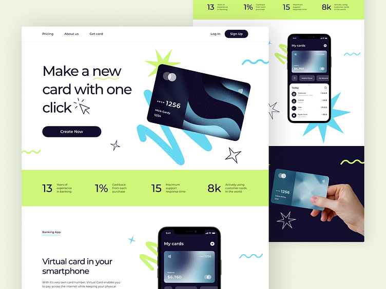
Bank Card Landing Page
💌 Have a project idea? We are available for new projects!
info@ronasit.com | Telegram | WhatsApp | Facebook | Linkedin | Website
Landing pages convert a lot of traffic because their navigation is limited. Thus the users don’t get distracted by numerous links that take them away to other sites, so they focus all their attention on product information. Here’s our new concept of a banking app landing page!
The vivid and well-balanced design of this landing page is most likely to catch the attention of potential service users. The well-structured information layout makes this landing page easy and convenient to navigate.
For this concept, we chose a light and airy color palette with light purple and green as the main accenting colors. Also, we added skeuomorphic bank card images to make the landing page look more trustworthy.


