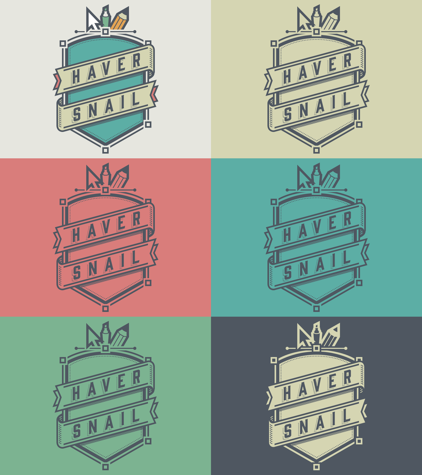
Vintage Emblem
Trying my hand at something new.
Working on a personal site launch, and after what's gotta be the fifth or six design overhaul, I thought I'd try something bold and pursue a more vintage look. Trying to accomplish a classy, rustic feel while keeping it clean-cut and free of excess clutter and ornamentation. This is my first go-around with the logo concept and palette, so let me know what you think! Comments are always appreciated.
More by Alex Havermale View profile
Like
