Dog Walker App
This dog walking app was completed as a part of Dribbble's Product Design Course. We were given a project brief, weekly check-ins and brainstorming sessions, but the end result was up to us. Here's my findings, and the design and prototype I created as a result!
To start, we were asked to identify pain points within current dog owners when they’re looking for dog walkers and sitters. Here are the most common points our group found...
We then took a look at current apps and services. What were they missing?
After looking at ratings, polling friends and family, and conducting interviews, here are the most common frustrations within these apps:
To address these problems, we brainstormed the following solutions...
From here, we were individually tasked with working on user flows. You can see the first iteration of my flow below.
The next task was to work on first iterations of wireframes for three important screens: the search screen, the dog walker profile screen, and a messaging screen. I began with lots of sketches, then moved to Figma. Honesty time! While I fit in the necessary information here, I learned that I needed to be less vague in future wireframing efforts.
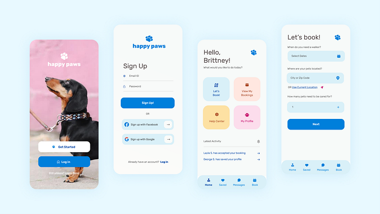
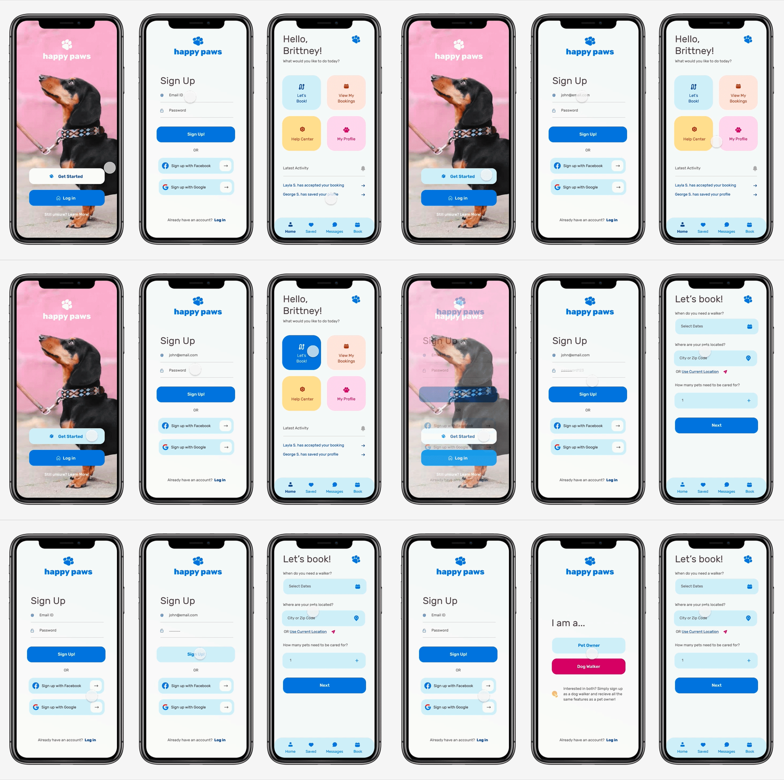
From here, I moved to visual design. We weren't given a brand, so that meant we needed to develop a fake one. I found that most existing apps used red or green with harsher angles, so I wanted to stray from that with a happier, friendlier approach. I was then tasked with developing the three screens shown above, as well as a log in sequence.
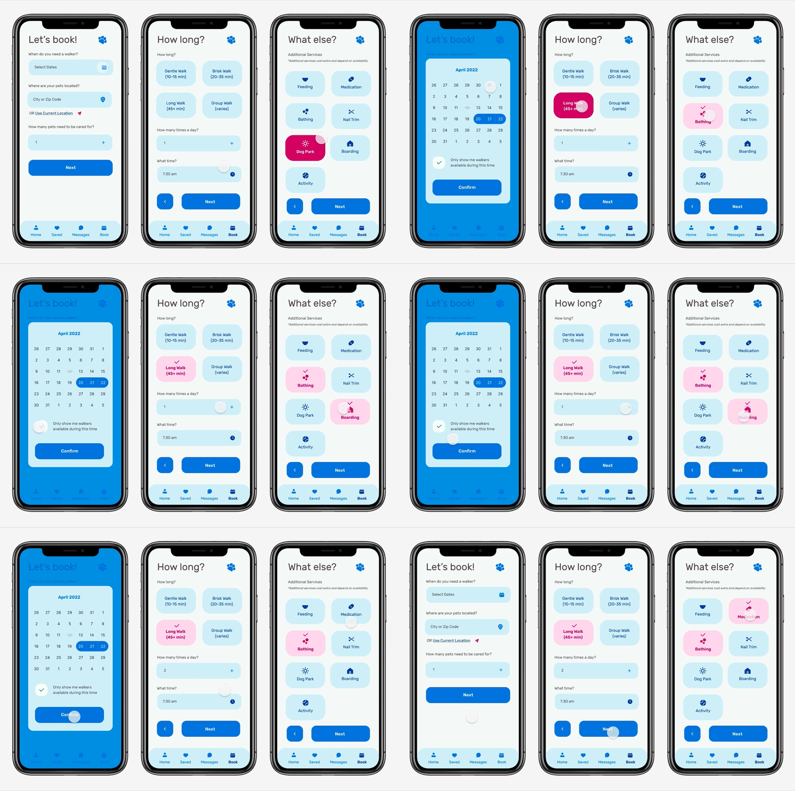
But felt it was important to work on the booking sequence in addition to those required. I'd never done anything like this, and it forced me to think through the actual problems we listed above, the user experience of navigating an easy process, and what steps were necessary.
The next step was developing a prototype, and that meant ensuring the design system had all necessary components.
Testing revealed a few weeks spots. I ran initial tests by recording friends and family walking through the app to identify pain points. That way, I could see in real time when they were thinking about decisions or struggling to find where to click.
The problems I addressed in testing phase one were:
1. Ensuring the user could go back and edit information in the booking process. This includes being able to 'uncheck' a box
2. The check box on the calendar should be auto-checked (as seen below), as it's rare that a user won't want to see available walkers
3. The heart favicon looked like it was already 'favorited', and it was difficult to 'unlike'
4. User got trapped in each booking screen if they wanted to change or update certain information
The problems I addressed in testing phase two were:
1. User got trapped at the 'congrats' screen. They didn't realize they could click outside the box. I've updated it by removing the ability to click out altogether, as that's unnecessary, and sending the user straight to the dashboard.
2. The message screen needs to go back to the screen the user entered it from, whether that be the dashboard, or the profile screen.
Personal Takeaways...
Overall, it was a great learning experience, and a fun first project to try out product design. There's about a million things I would do differently next time around, but product design by nature is all about learning and growth. So, I'll consider this a success.
Thank you!


