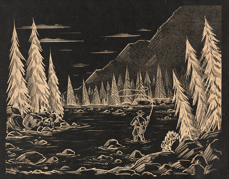
Lone Angler Case Study
I originally posted some work from this some time back in 2020 not long after this beer went into production.
Well just recently I discovered the rough and higher fidelity composition sketches for it and with Dribbble now supporting cast studies, it felt like a great time to get this one posted.
Here's a view of the completed original artwork. In the long run we tinted the colors a bit cooler, which you can see on the can art, but here's where I landed prior to those final tweaks.
Here's a little crop in on our main character. This guy gives me big Dr. Grant (from Jurassic Park) vibes so I liked to pretend while working on this project that this is a little vignette of him in retirement a few years after escaping Isla Nublar.
These were the final 4 ultra rough thumbnails I sent the client to get their buy in on a composition for the artwork. Working with an agency like Ebbing Brands (now called Creature Theory), I knew that they had a solid imagination and could make a lot of sense of sketches this rough. I might have opted for some more detail when working for a client less comfortable with the sketch > final artwork pipeline.
Sketch 1: A set of two opposing point bar banks with with a fisherman in the foreground
Sketch 2: Similar composition but with trees added to the midground and a little more of a rocky riverbank
Sketch 3: Here's Dr. Grant on an outcrop of rocks in what seems to be a small lake.
Sketch 4: Similar to before but with more trees and the further banks brought closer to the foreground. This was our winning composition.
1st Tight Sketch: First draft of the tight sketch. Client loved this overall but I recall then wanted a little tiny bit more foreground and we felt that having him wade in the water would connect him to the scene better.
Final Tight Sketch: And here's those final adjustments


