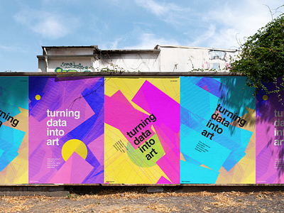
Experimental Graphic Design Posters
This actually started out as something completely different!
I was working on an infographic, trying to visualise popular Dribbble layouts for mobile UI shots.
I picked 60 uploads from Dribbble, placed them on top of each-other, and replaced each screen with a transparant flat color layer. Hoping to get something like a heatmap of popular layouts.
It was an unsuccessful infographic, but turned out to be a very nice poster background.
Data and art, or data and design, are often seen as opposites, things that don't go hand in hand. Love seeing it come together in ways like this.
Data as inspiration for art.
Any feedback? I usually don't do posters :)
More by Mark View profile
Like


