Source
Done last June, sadly never coded up.
Edit: Hats off guys, I am not getting away with it :)
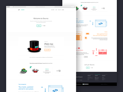
As for the visual direction I took similar approach to Layervault and Dropbox. At the time, I felt that their design teams have brought the most beautiful (and subjectively, accurate) way to express couple of values and principles these companies and Source had in common.
Source is a design driven company. They are backed by state-of-art technology, they focus on building user friendly, beautiful, polished - and almost magical products. These tools are useful and easy to understand.
Object of admiration and desire is not much the company itself, but the products, that reached the highest standards to become "Made by Source".
That's why visual direction of Source takes a step back and communicate only the most necessary information. This attitude is conveyed by extreme simplicity, visual clarity, straight forward typography, big white-spaces and, on the contrary, colourful graphics.
All that to make the landing page more straight forward, honest and human.
TL;DR: I sometimes steal, if it make sense.

