ASICS Logo redesign v.1
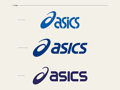
I decided to redesign the ASICS brand’s basic identity by giving a different perspective to the brand with minimal design strategy through visuals, website (both laptop and mobile) and packaging. While trying to rebranding I imagined a new logo. The ASICS spiral symbol expresses dynamism with boundless opportunities and potentialities towards sports in a simple but with an innovative approach. So, my aim was to make a conspicuous logo by keeping the original style intact. Hence, I managed to redesign the logo with the intention to make it a more sophisticated with an innovative approach. As regards symbol/icon part is concerned, it will look like the letter “a” in a more dynamic sense without harming its spiral. For the wordmark part, I managed to create a stable and structured typographical design with fixed width, which give it a personality that is quite raw and more balanced.
Link to full project: https://www.behance.net/gallery/122994861/ASICS-Rebranding-Concept
