fido - Trustworthy & Local Dog Walkers

As part of my Dribbble Product Design Course, I was tasked with creating a dog walking app. Read on to see how I approached this project and learn the 🥜 and 🔩 of my design process.
The Problem
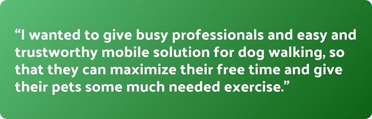
Everyone is busy these days. Many people say they work from home, but sometimes it may feel more like living at work. And as people get busier, their pets pay the price of missing out on their daily walks! This project aimed to focus on those pet owners who lack the time to walk their dogs. I wanted to give busy professionals an easy and trustworthy mobile solution for dog walking so that they can maximize their free time and give their pets some much-needed exercise.
My Role
For this project, I did all the research, interviews, visual design, branding, and testing for this concept application. Although I was a team of one I did have frequent feedback from mentors, fellow designers, and users. This informed the direction of the project and was invaluable in creating the final prototype.
The Solution
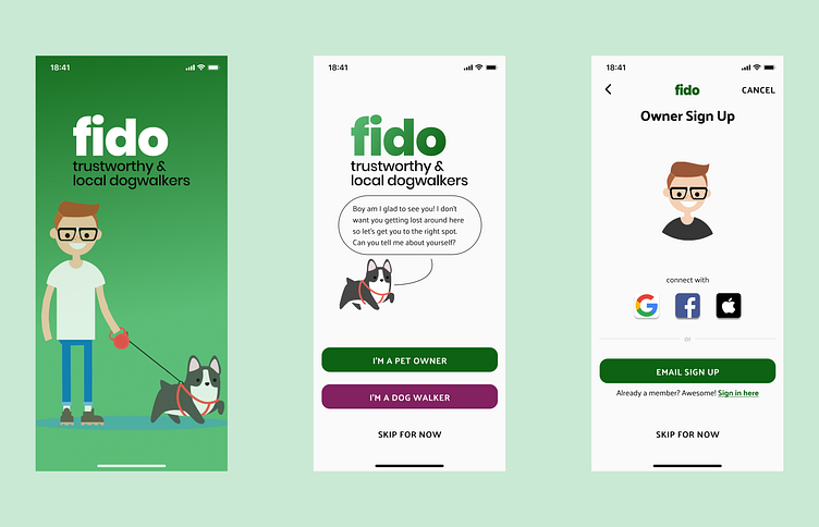
fido is the result of prioritizing the customer and combining trust and fun into an easy mobile dog walking solution. Using green as fido's main color is right in line with other applications in the industry, giving this application an air of familiarity even though it's a new product.
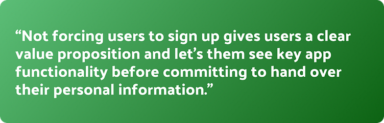
Top of mind was creating a way to "test drive" the application without having to necessarily sign up. I think this respects the user's time and furthers trust in the app since they aren't asking for information without knowing if this is something they would want. Not forcing users to sign up gives users a clear value proposition and lets them see key app functionality before committing to handing over their personal information. If we are asking people to entrust people's beloved pets to strangers, fido should strive to instill trust in itself as well.
Check out the Figma prototype here or see the auto-playing video below for a glimpse of the onboarding and booking flow.
Process
Sniffing out the Competition
First, I took a look at some of the apps already doing something similar. Rover & Wag are the top applications that offer dog walking. While Rover has a functional app, it's focused on more than dog walking and could make it harder to trust one service over the other. Wag had a similar problem and also a frustratingly long onboarding process that could not be skipped. Comparing these two apps gave me two important cornerstones of my application:
1) Make the onboarding short or optional. Respecting users' time is paramount to establishing trust and asking for too much information upfront could be a recipe for disaster. Making the onboarding skippable, or more accurately brought up in context, gives users a reason to enter this information once the situation necessitates this to move forward.
2) To be a player in the dog walking space, I would use a branding color that was already established in the market. Since green was already the color of Rover & Wag, we instantaneously put ourselves on their level by selecting green as our branding color. A marked effort would be made to establish our product differences elsewhere.
Following the Scent
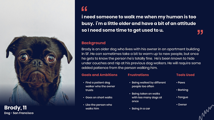
Establishing who might be the audience is key in producing an app that meets user needs. After asking a few rounds of questions to existing dog walker customers and finding their pain points, I had a rough idea of who might be the ideal user. Building out this user persona would help drive the project to meet this potential user's needs. To make it extra fun, I made it through the eyes of the dog itself! Although this is a bit tongue-in-cheek, there is a surprising amount of depth to the persona. It's surprising how much data you can hint at what's needed from the pet owner by personifying the dog's needs.
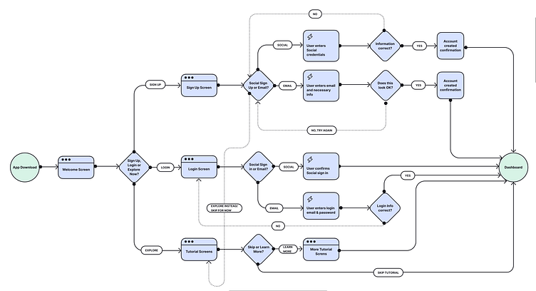
Having an idea of who the audience could be, it was time to shift focus to the application functionality. Designing a good user flow would help me make sure the app didn't have any issues moving from one part to the next. This project had a quick turnaround so I wanted to focus on the onboarding flow first. Not pictured in this version is the additional onboarding choice of being a "walker" or "pet owner." This need would eventually surface as it helps connect the dots on how these two populations would meet and intersect.
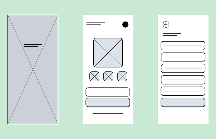
Learning to Sit
With the onboarding planned out, it was time to drum up ideas for the actual information hierarchy and layout of the application. Ideating quickly is an easy way to do that, and so I did this for a few key screens: Main Onboarding, Dog Walker Select, Profile & Checkout/Messaging. Sketches in a red or blue border are some ideas I further explored.
In a perfect world I would have taken the wireframes and built out the entire application, but as every designer knows, dealing with constraints effectively is a necessary skill. Budgets are finite and often, so is the time to complete designs. With that in mind, I focused on some of the defining moments so far of the application—onboarding and selecting a dog walker. Focusing on this minimum viable product keeps my application intent on accomplishing my goal and leaves me plenty of room to expand to other ideas once these pivotal screens are working well.
Visiting the Groomer
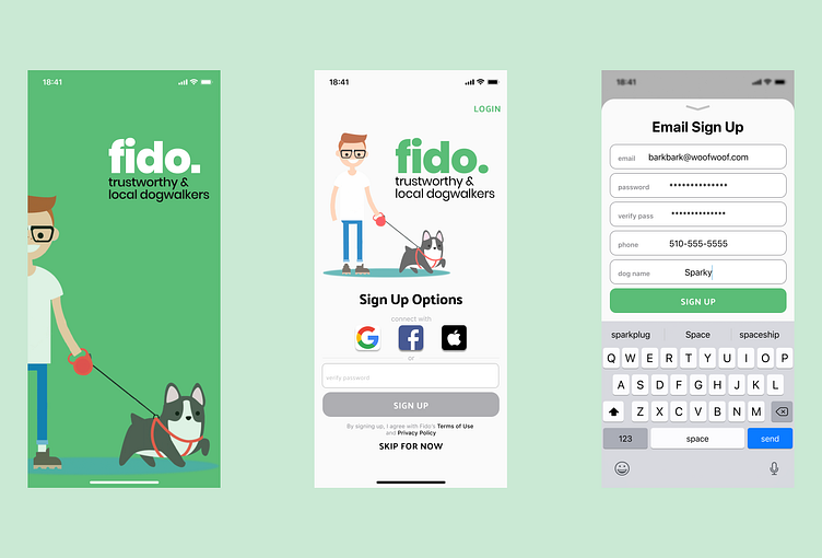
As I already knew I had green as the main color, I dabbled in selecting a green that was similar to what others in the market used, but slightly different. The green I landed on #5BBD77, was inviting, warm, and fun. Visit my full color palette for fido here.
But while that green was fun, it also made it really difficult to read my white text—especially on the main Sign Up page below. Since this was only my first pass at adding color and text I decided to keep going. Revisions will inevitably become necessary anyway, so no need to get bogged down in making it perfect now. Eventually, this green would need to darken to pass WCAG, so I kept that in mind and moved on. Similar issues could be seen with certain grey text as well.
Ready for the Dog Show
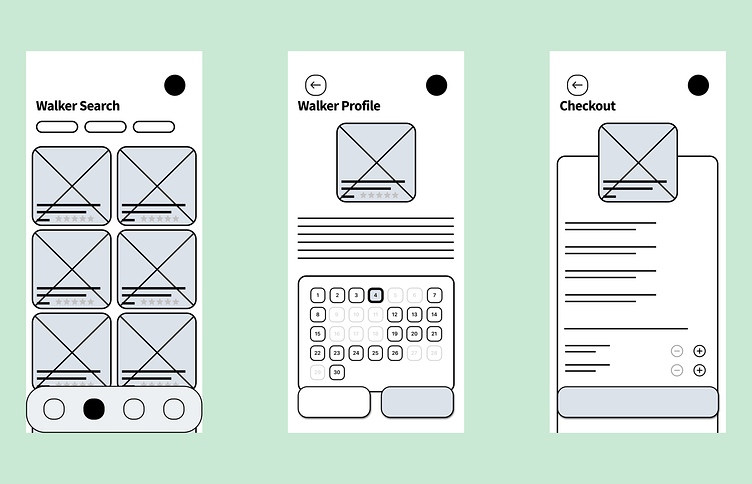
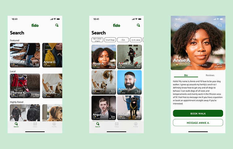
The bulk of my time was spent making the Onboarding and Dog Walker Select screens more built out and robust. Feedback gathered so far had made it obvious I needed a darker green, so every effort was made to create color styles that made things legible. I also eventually landed on a fun typeface that works at various weights: Palanquin. It balances with the images well and gives an approachable vibe to the entire project.
I worked to create a more interesting green gradient in places and established components for most things to make tweaks in the cards and text sizing much easier. I made a mini design system to keep things consistent and used color sparingly to keep things looking clean and balanced.
Learning New Tricks
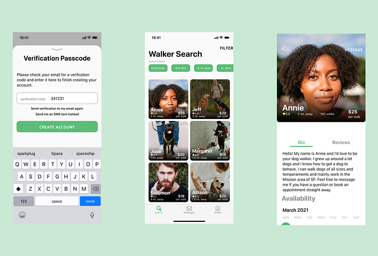
After testing with a few people and gathering even more feedback, it was time to clean up a few last things in the prototype. In certain places, the typeface spacing got a little tight—especially in cards where I used some of the smaller font sizes. I also would need to change the magnifying glass icon to instead look like a filter icon to make it more clear what it does. I also added functional tab segmentation within the Profile page to add further functionality. Thankfully the flow made sense and all tests ran with users accomplished their goal of booking Annie as their dog walker.
See the finished prototype below or click here to test it yourself.
Reflections
As a dog owner myself, it was easy to imagine some of the pain points of dog walking and channel those into a trustworthy app. I think I really nailed the "cute" aesthetic for the app. Another big win was selecting green as a primary color. It really helped visually elevate this upstart dog walking app into the same place as some of its competition.
And while I was able to instill trust by not wasting folks' time during onboarding, I missed the mark on providing more ways to trust users besides the number of walks they've accomplished. Badging of some sort would have really sold the idea that certain dog walkers are better than others (think Yelp elites). I'm also assuming I delivered on becoming trustworthy. Having a post-prototype survey could help glean important data from users and inform if the app feels trustworthy. I also didn't create enough screens around the "Skip for Now" flow. The idea was once they skipped they could still explore the application but would face a signup prompt once they engaged with any users on the platform. I hint at this with a modal popup, but creating a few more screens would help cement this. Honestly, this was perhaps my biggest misstep as allowing exploration is a key element of fido.
If I had more time, I would have liked to create a fleshed-out checkout process. In my prototype, folks book the walkers but never input their payment methods. I could work this into the Checkout screen and keep the Pay button greyed out until it's on file, but I opted to focus on other parts of the app. I'd also really like to explore onboarding the dog walkers. I only focused on the pet owner flow, but it would be interesting to see the differences and overlap between both populations of users. Lastly, I would have loved to create a place to see pets. Possibly adding a "Featured Pets" area would be one way to drive community engagement. Or maybe even have a place to add a pet picture to someone's profile. Exploring these ideas could help minimize churn, keep users engaged and make them longtime users of fido.