GitLab logo
I've been excited to share this one for some time. The ability to take something so fundamental to a brand and integrate it into the logomark without being overt is one of my favorite techniques.
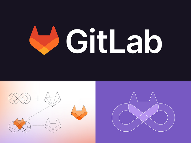
GitLab is the one platform for DevOps, and as I stared at that infinity loop I couldn't help but see the angles form the shape of the angular tanuki. I wanted to flip that, so instead of seeing the tanuki in DevOps, I saw the DevOps in the Tanuki.
The colorway emphasizes coming together in a singular focus.
The combination of rounded and sharp angles is a nod to the bouba-kiki effect and sound symbolism where "git" and "lab" have both sharp and rounded sounds.
I chose Inter as the typeface not only because it compliments the logo mark well, but also because it's great for UI and has helpful disambiguation and stylistic alternate options that will make content more clear.
To be true to the GitLab brand, this was also based on iteration and moving the brand forward in a fresh, but recognizable way.
There's much more I could unpack here, but I'll save it for a case study. Many thanks to everyone who helped with the brand update by providing great input and additional concepts, and who ultimately made this a reality.
