Payment Screen
I just love the color purple, there's this easiness it has on the eyes.
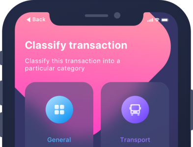
I designed this payment interface with simplicity in mind using Adobe XD. It's a payment screen with each bill you might probably ever need to pay as in categories.
It's simple, easy to understand, not cluttered. It's everything users need in their payment screens.
More by UI Maestro View profile
Like
